Personal Project: Abstraction
Abstraction is the process of taking away or removing characteristics from something in order to reduce it to a set of essential characteristics. In the same way that abstraction sometimes works in art, the object that remains is a representation of the original, with unwanted detail excluded.
Like abstract art, abstract photography concentrates on shape, form, colour, pattern and texture. The viewer is often unable to see the whole object. The subject of the photo is often only a small part of the idea of the image. Viewers may only know the essence of the image subject or understand it by what is implied. Often the image will not be a literal view of the subject itself. The subject tends to come second to seeing. The impact of aspects of the subject become a form of expressing the point.
Abstract
- 1.
existing in thought or as an idea but not having a physical or concrete existence.
"abstract concepts such as love or beauty"
synonyms:theoretical, conceptual, notional, intellectual, metaphysical,philosophical, academic; - 2.
relating to or denoting art that does not attempt to represent external reality, but rather seeks to achieve its effect using shapes, colours, and textures.
"abstract pictures"
synonyms:non-representational, non-realistic, non-pictorial, symbolic,impressionistic"abstract art"
|
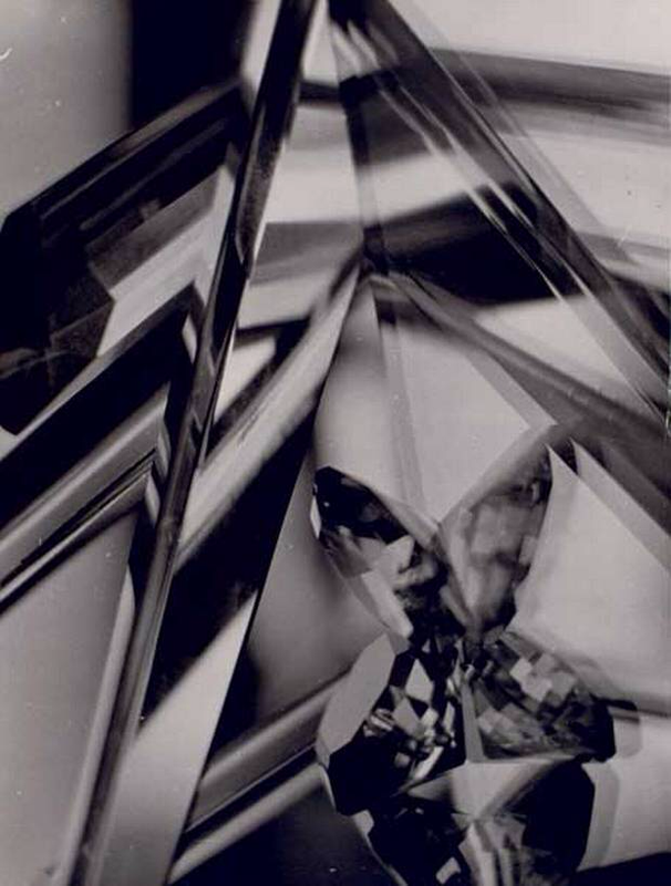
Paul Strand
Paul Strand was an American photographer and filmmaker who, along with fellow modernist photographers like Alfred Stieglitz and Edward Weston, helped establish photography as an art form in the 20th century. His diverse body of work, spanning six decades, covers numerous genres and subjects throughout the Americas, Europe, and Africa. Treating the human condition in the modern urban context, Strand's photographs are a subversive alternative to the studio portrait of glamour and power 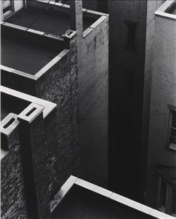
|
|
|
|
Matthew TischlerMatthew Tischler lives and works in New York City. He earned a BA in filmmaking and photography from Sarah Lawrence College. His work has also been exhibited at Real Art Ways, HEREart, Organization of Independent Artists, Viridian Artists and Gen Art. He is a recipient of a Van Lier film grant from Film/Video Arts and was a finalist for the Sundance Institute's Feature Film Project. His work has been published in Photographer's Forum and the book Exploring Color Photography.
|
First Response
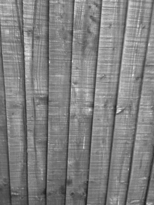
Lines
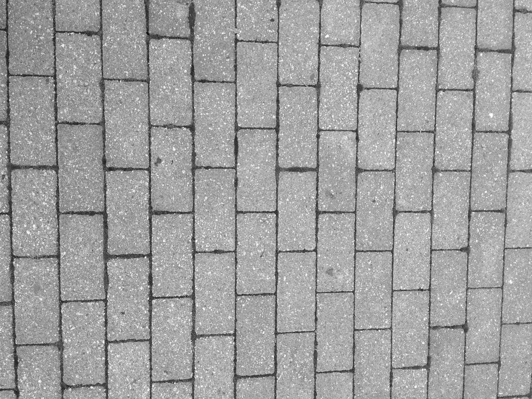
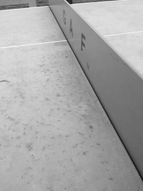
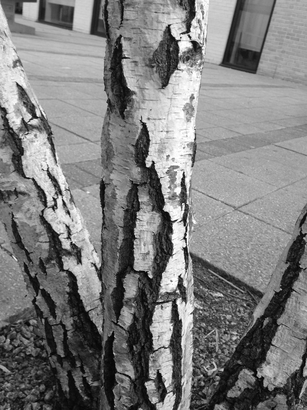
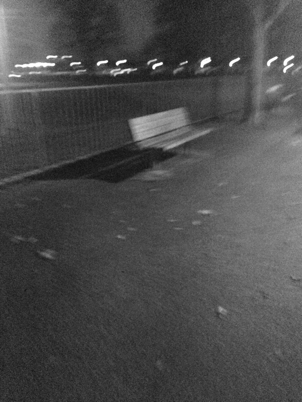
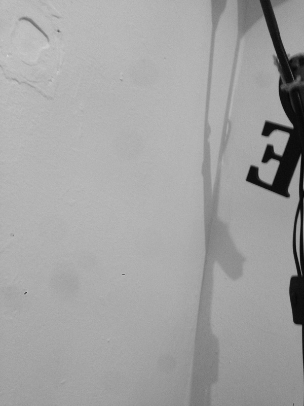
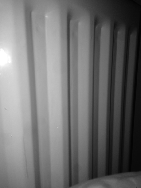
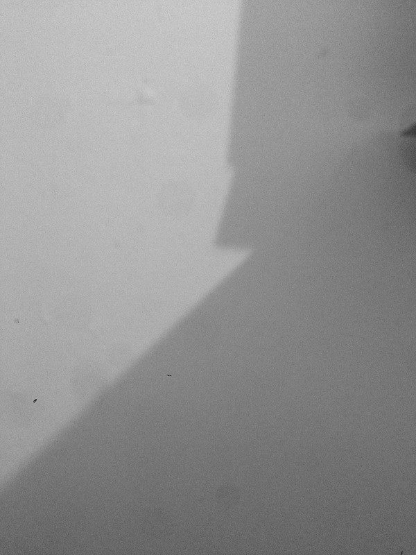
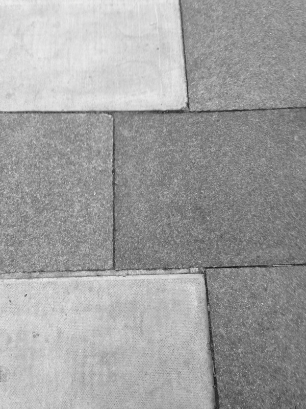
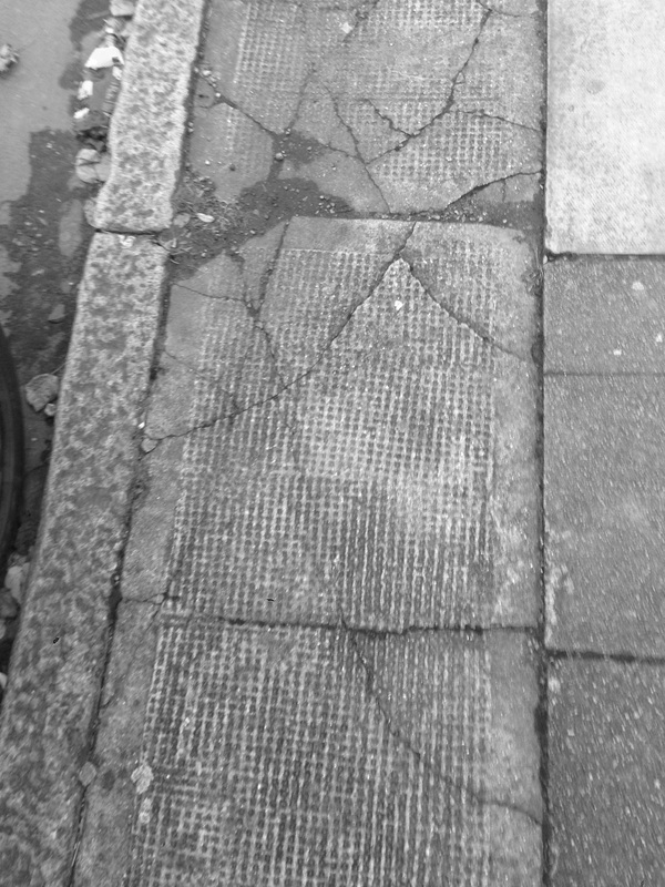
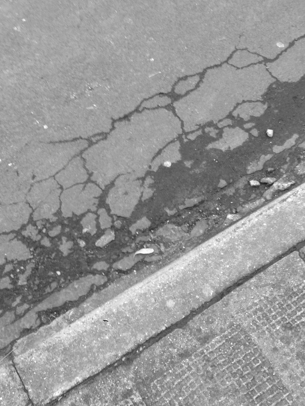
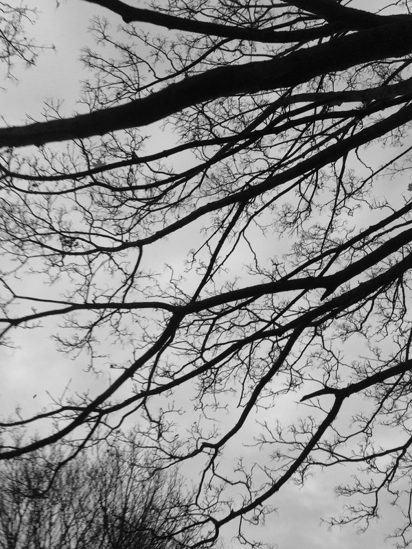
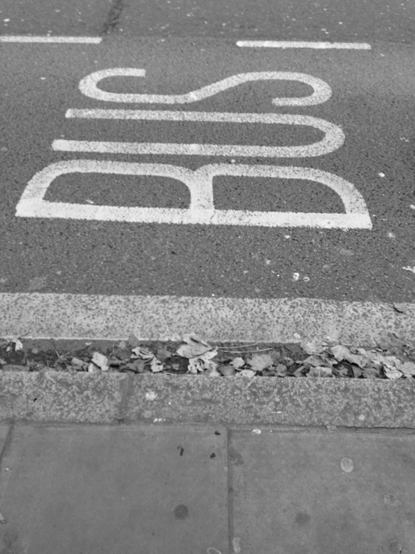
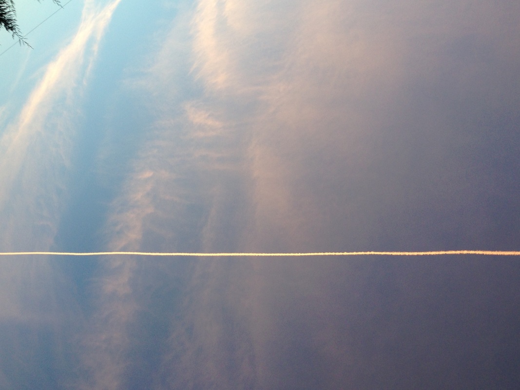
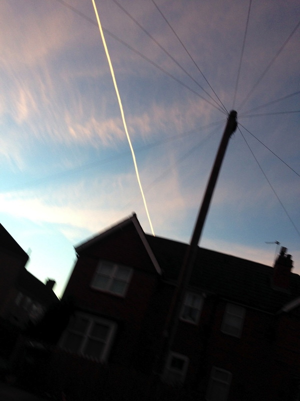
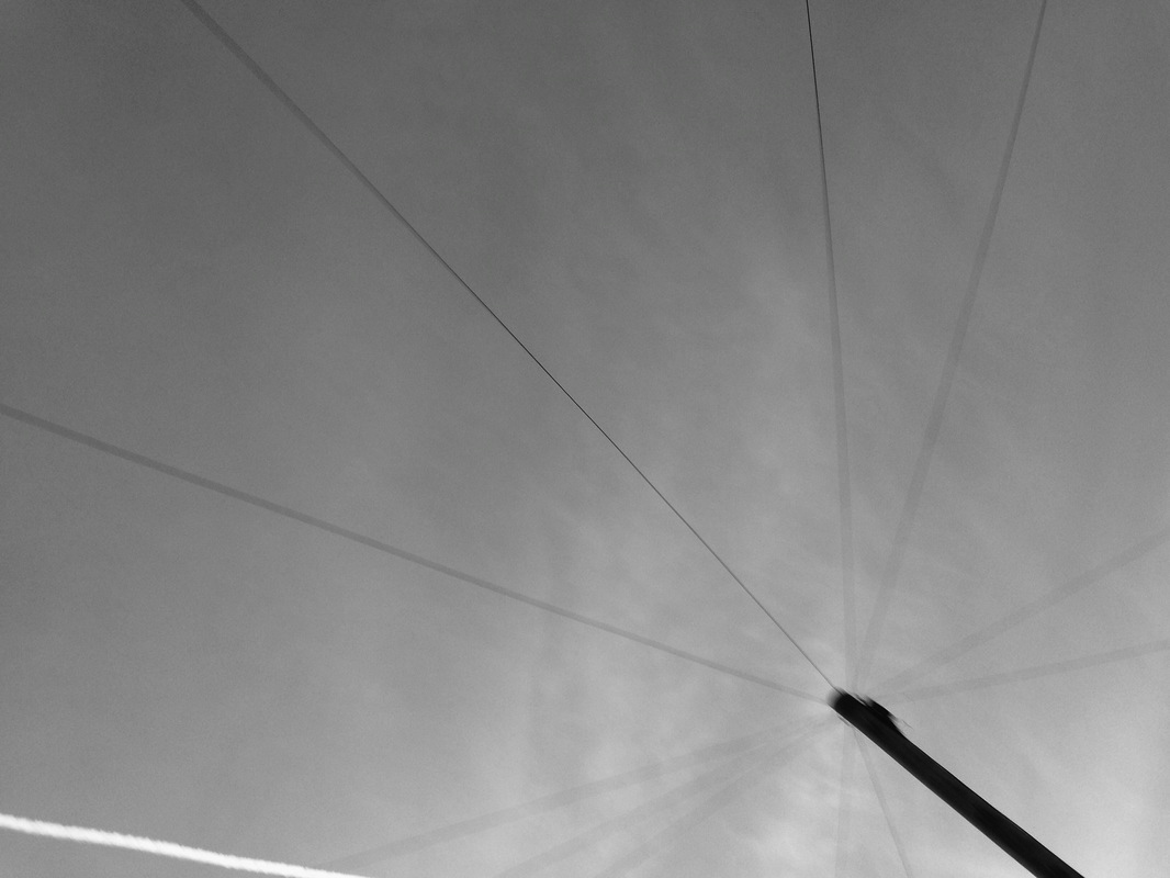
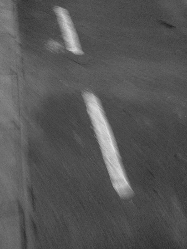
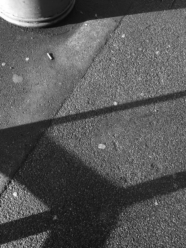
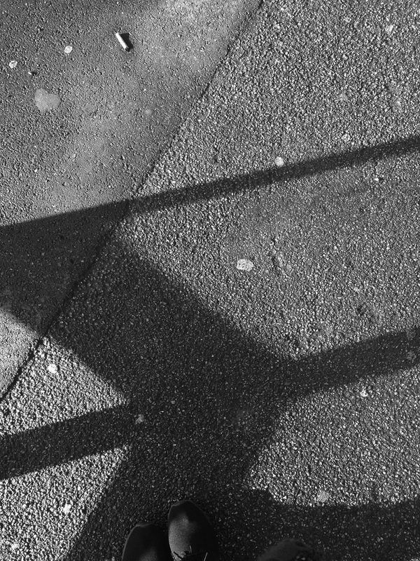
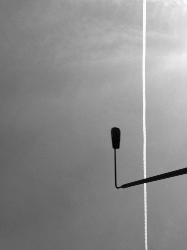
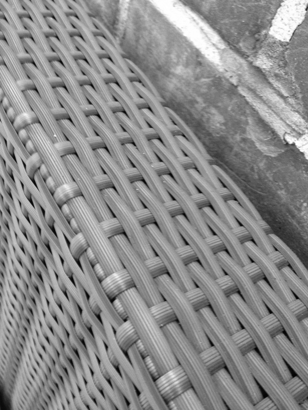
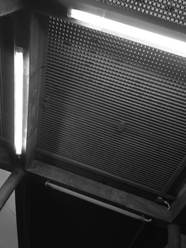
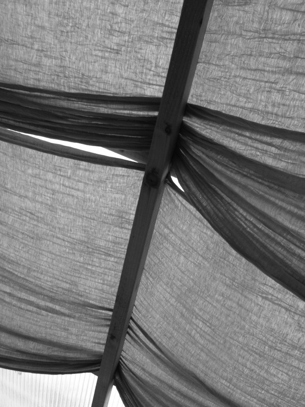
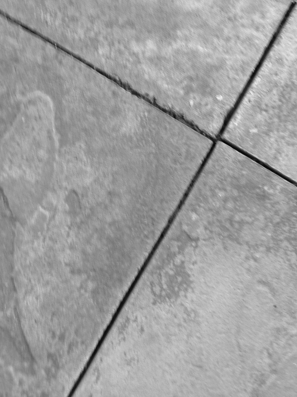
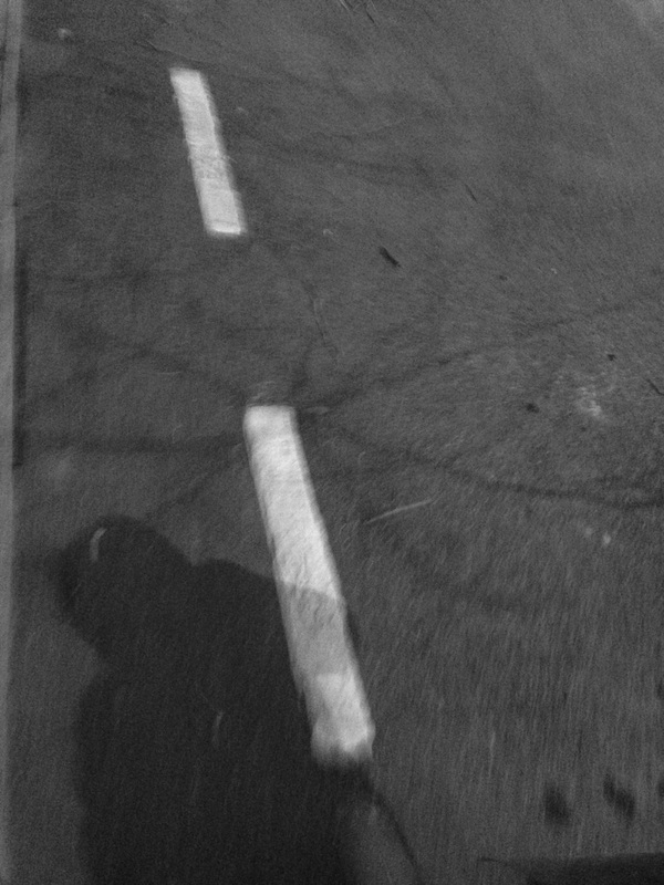
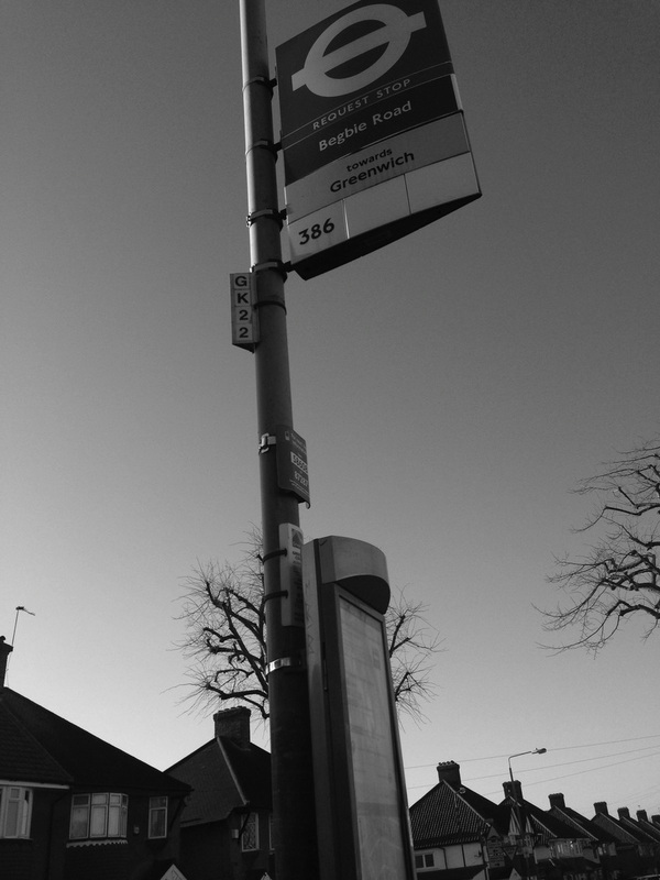
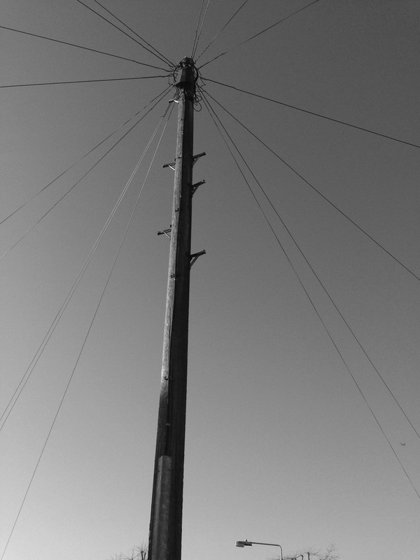
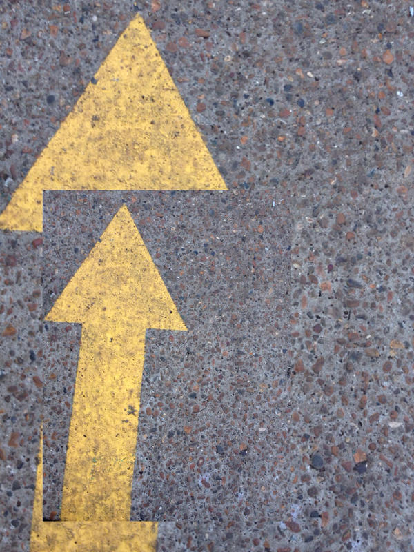
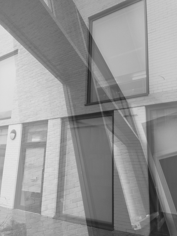
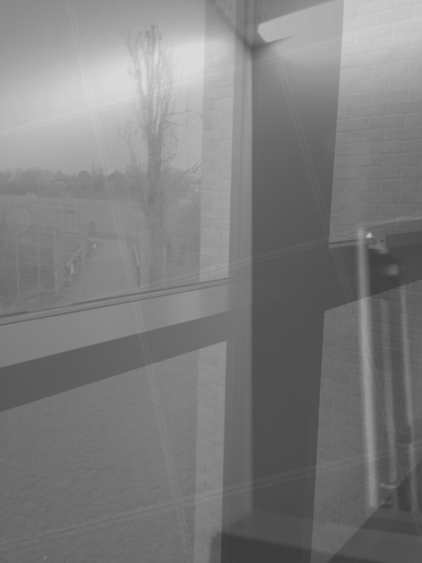
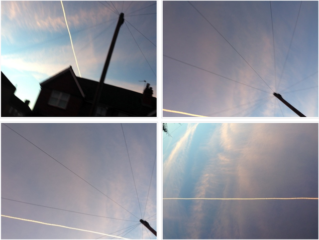
These images were taken around the school and i was focusing on the theme of lines of which i decided to carry on from the idea of my first set of images. I thought these were quite successful but i didnt really put any thought into what i wanted and they were the pictures that where spontaneously taken because it was associated to my theme.
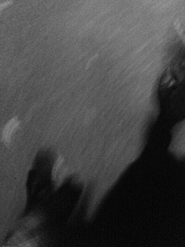
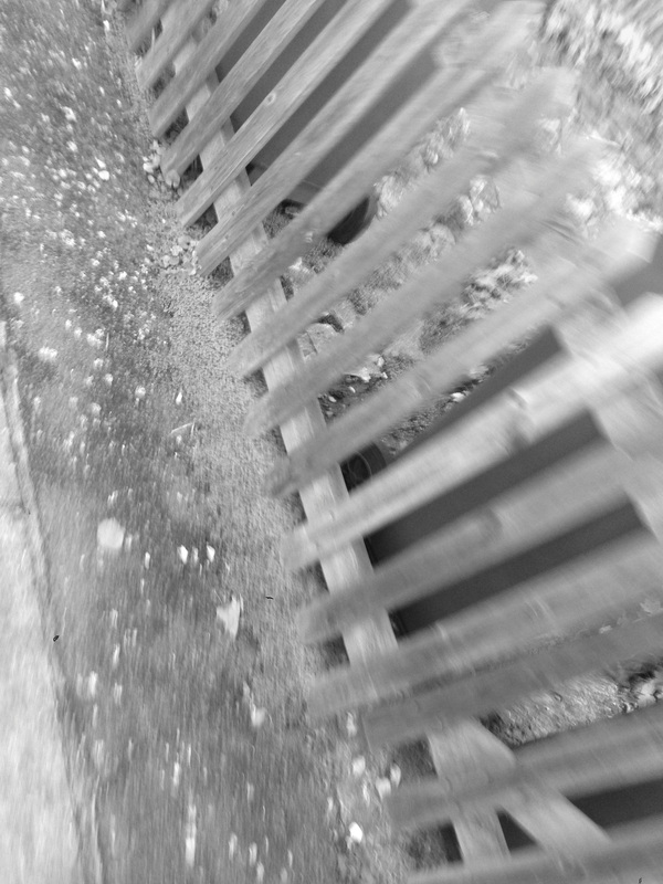
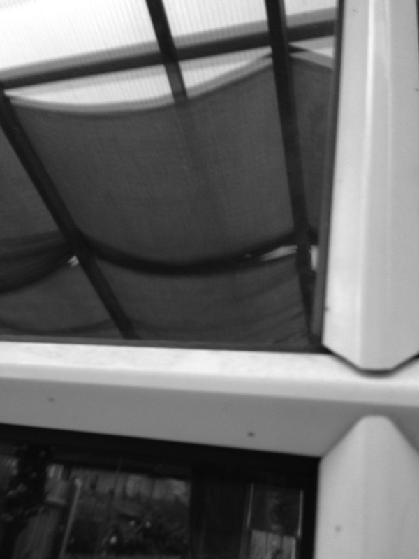
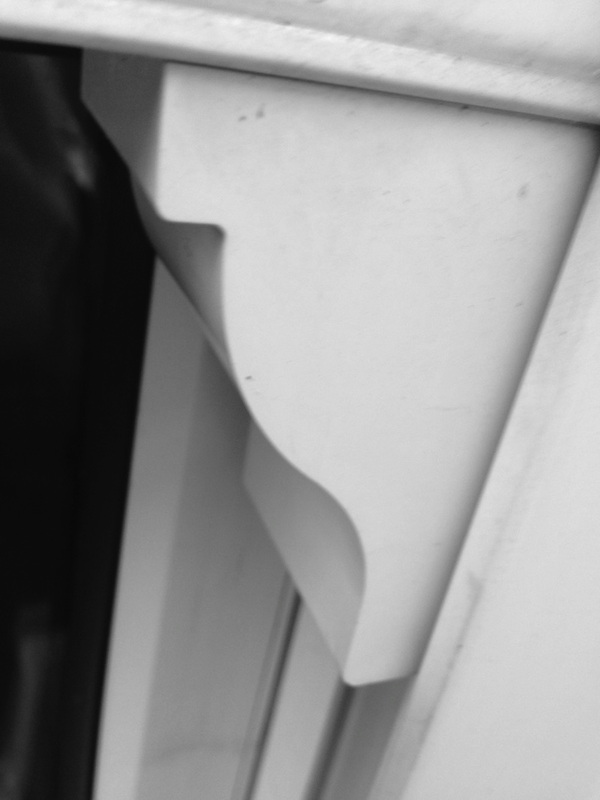
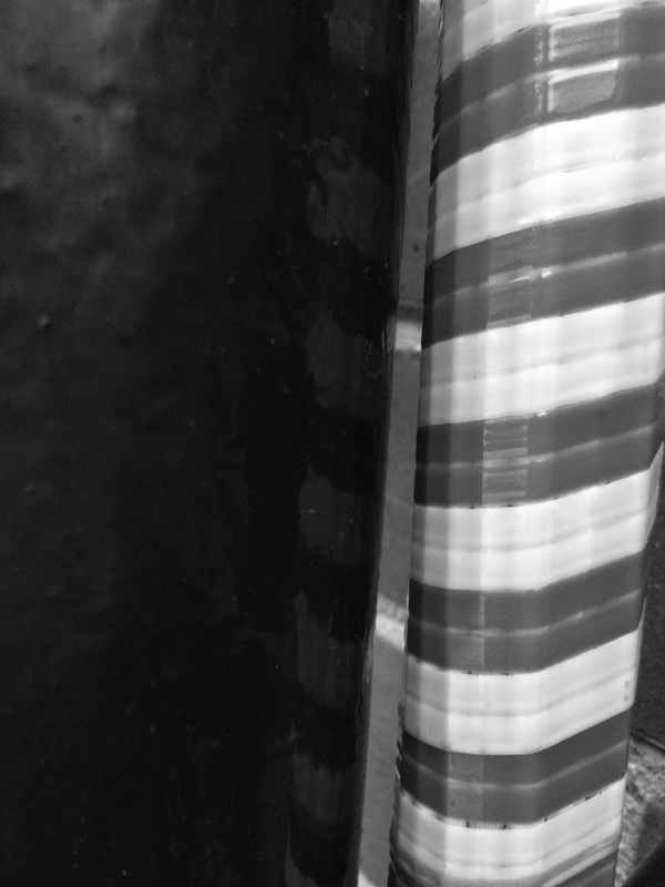
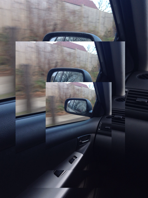
Focus
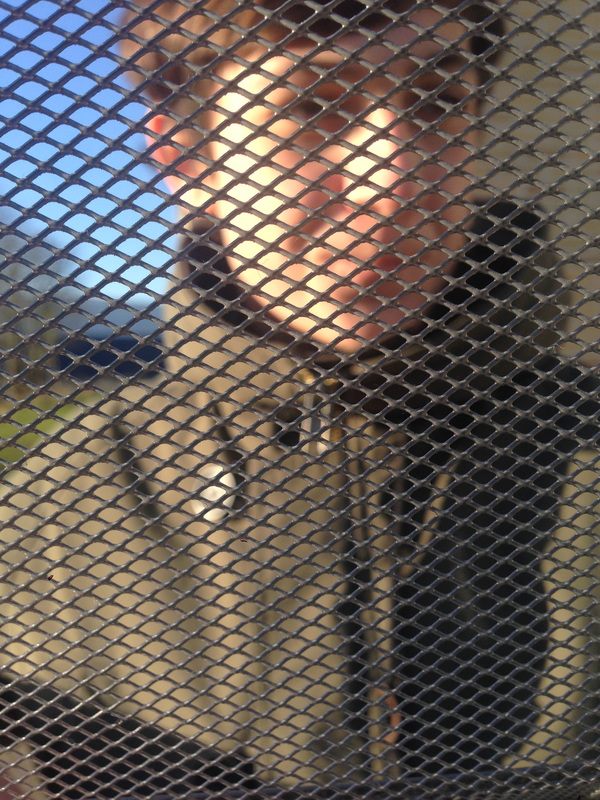
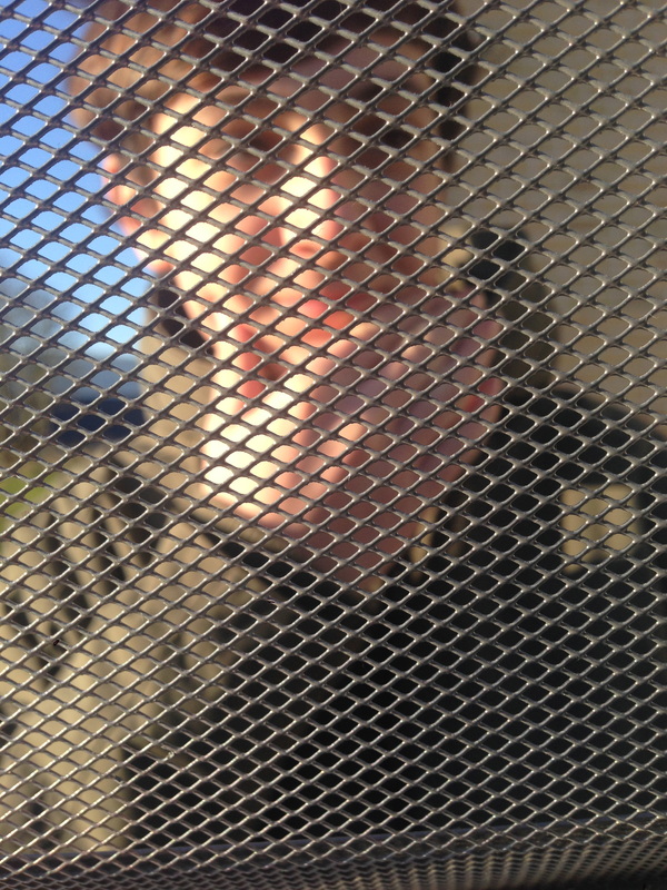
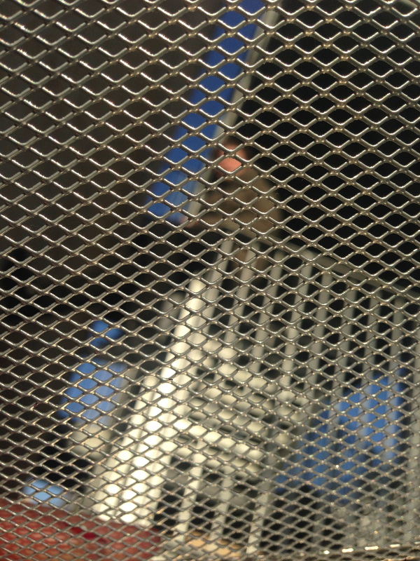
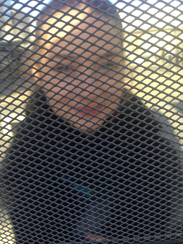
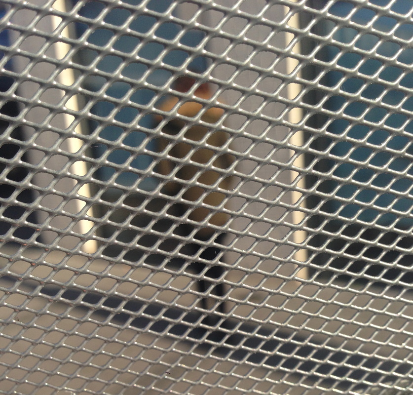
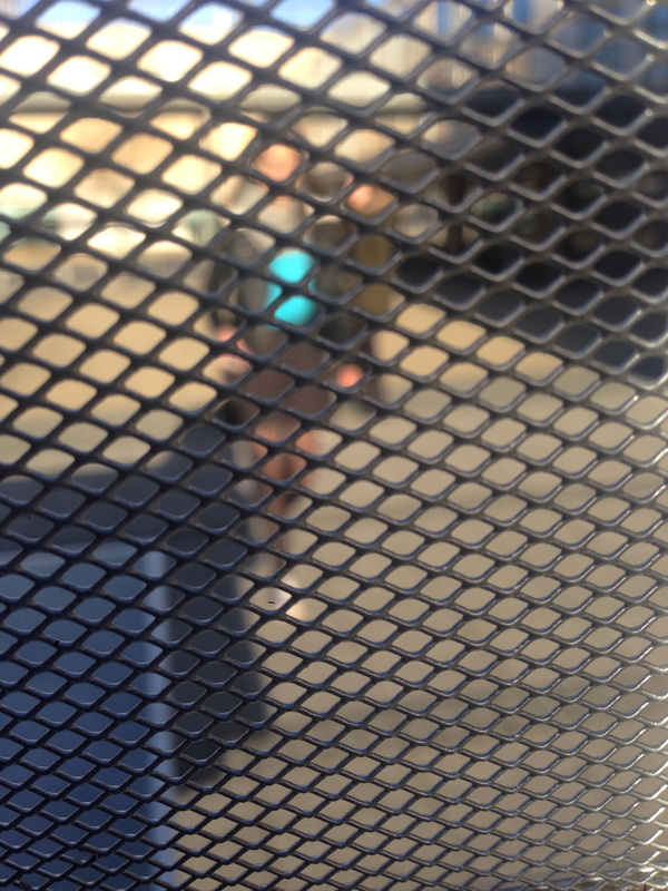
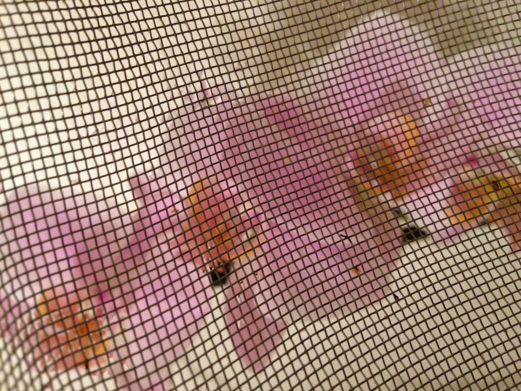
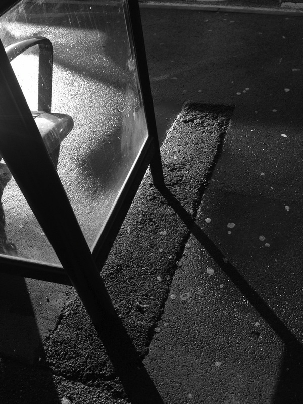
WWW: The aim of my subject was successful and i was very satisfied with the images that i'd taken. The theme that i had chosen was focus and the inspiration that i had to take these images were from a photographer called Matthew Tischler and these were my responses. I was really interested with the idea of focusing on the foreground and the background image blurred. To follow from Tischler's idea, i didn't know what to use to create the similar material he used therefore i incorporated it and thought of something similar but not the same. I used a book stand that was mesh.
EBI: I could have used a SLR camera as my iPhone was hard to manually adjust, although it had good quality it was hard getting the lens to focus on what i intended whereas a SLR camera would give me the ability to take what i want because i could control the lens and the settings. Also i'd like to take more photos outside of school because i reckon it would look better without the tallis uniform and the school building constantly in every image. If i do return to this idea i'd like to find something that had even smaller holes because when the camera was zoomed the holes often looked big still.
|
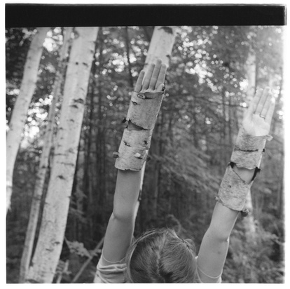
I like the way the image was composed and well thought about, I liked the idea she had of almost disguising her arms to seem as if they were mimicking the trees. Also you get a glimpse of light shining in the corner but i think she cropped it out because it could of taken away the focus of her arms and what she was trying to achieve. You can also see that she has blurred out the background to focus on her arms which i thought was a very good idea. |
|
|
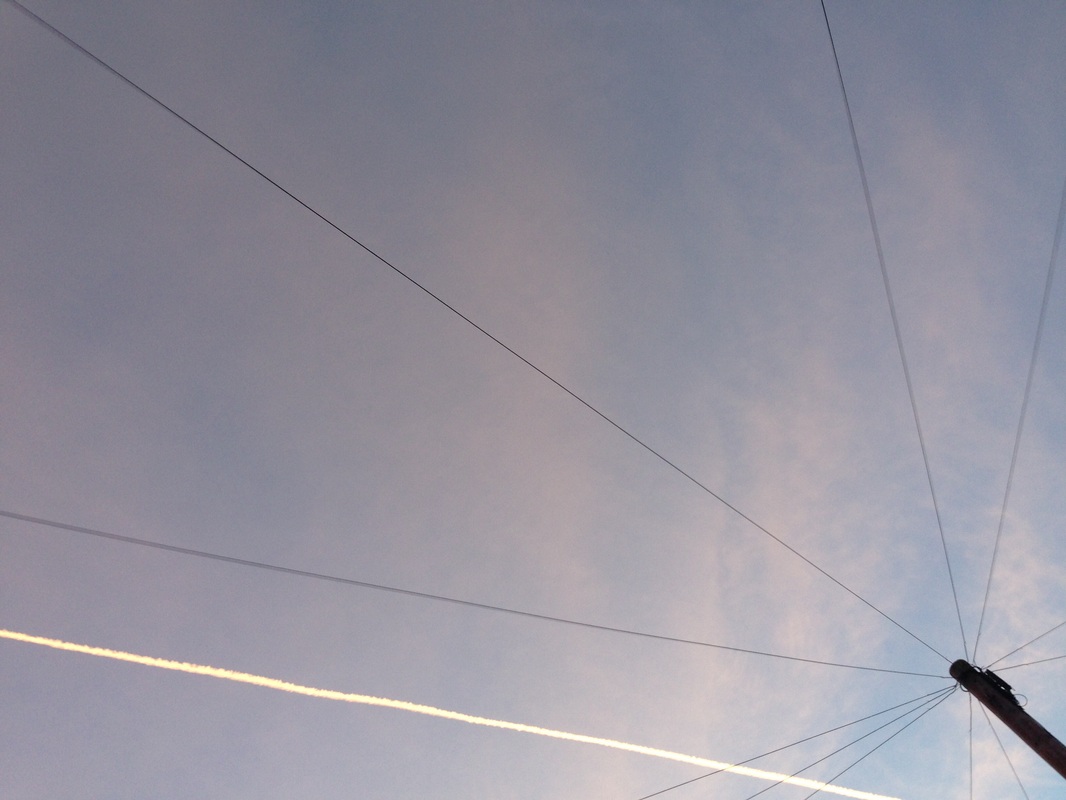
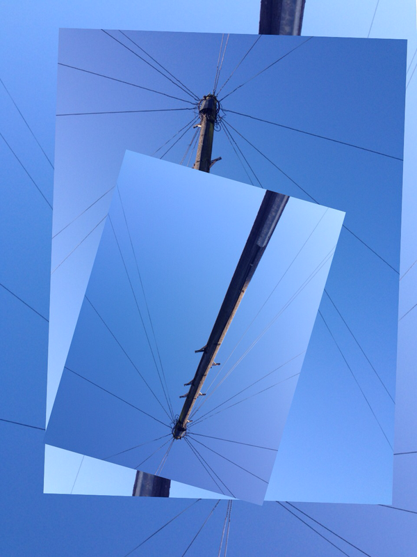
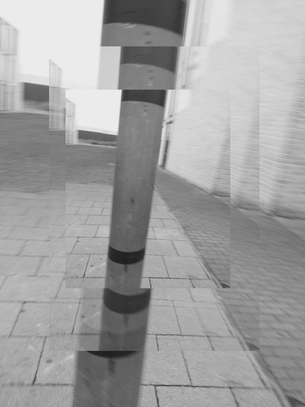
WWW: I thought my most successful image were of the pole and wired lines, I chose to incorporate that in 3 of my images and used them as a main focus. Although i use the same in each image i changed the theme in each of them, e.g one was focused on lines and the other was focus.
|
EBI: If i explored different things to take images of, because i stayed local therefore there wasn't much to focus on or think of. Therefore i would've liked more options when i took the images.
|
|
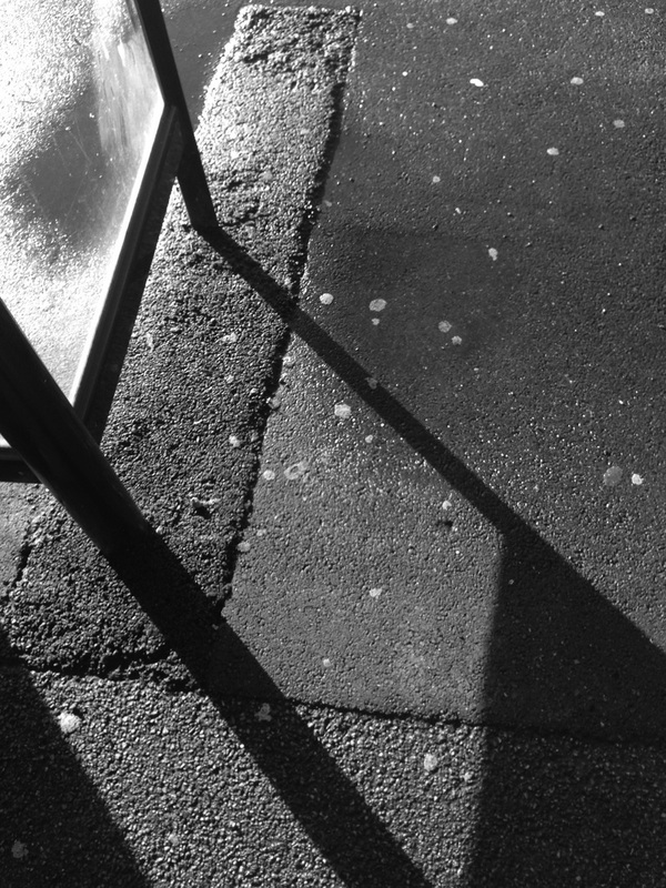
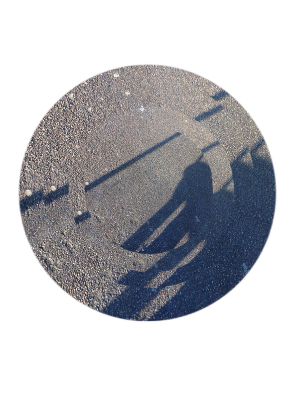
WWW: I was really satisfied with some of the images i had taken, e.g the first image i really liked because of the lines that were created by shadow. But i wasn't greatly impressed with some of the images. Although I didn't like the fact that we had to take 36 images, because it was hard trying to take 36 good ones. I think it would be better to take 12 really good ones that were well thought about rather than have 36 images and only half were good, because the all had to be thought about.
|
EBI: I should of composed my images better and thought about it, but this homework that was set didn't have enough of my attention because i wasn't really interested but if the task was set again, i would go to a different area to take images because taking images locally were boring and i had no fun.
What i'd do next is look for some apps that i could use for my next set of images and then look at more artists that also focuses on a similar theme to mine, i'd take inspiration from artists so i can have something to use.
|
|
|
|
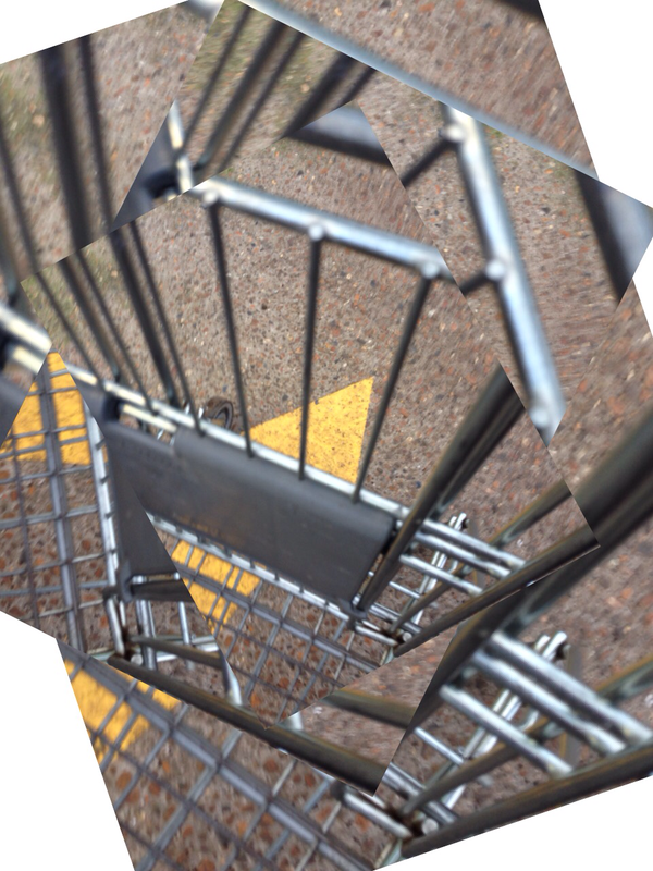
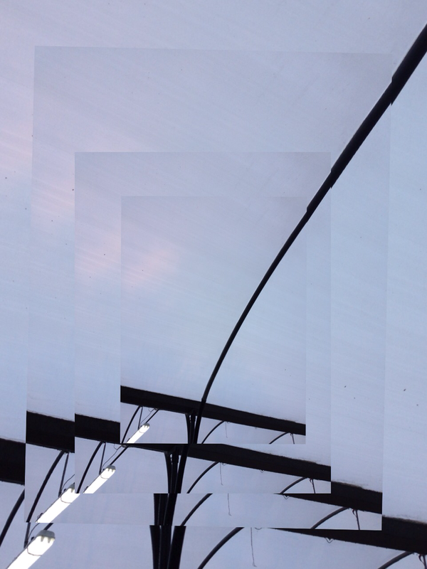
To extend my experiments and improvements i decided to take some inspiration from mr nicholls website aswell as pintrest and books. I decided to use apps to edit my images and crop them to make them look more interesting and developed. I used an app papelook which was similar to fragments but free. I took a set of images still related to my theme and incorporated them with the ideas i found and took inspiration from. But i just toyed around with several apps but i found using the app papelook was the best for me because i could control the way i wanted the images to be and how they were positioned when edited. Also i liked the fact that i edited my images as i have because they were simple images to start with and all i did was join several and reorganised them and now they look more complex? Or intriguing. From this task we were set i found some more interest in the whole task, i needed a newer plate of ideas and i think I successfully found them. But i'd like to use more resources in school when in lessons to carry on.
The images above are the images i'm most satisfied with as they are and as a set. I took images of everyday settings and things that are around constantly but we never take notice of them. My inspiration came from Alvin Langdon Coburn, i really liked his work and his combined images that worked together well. It seems he incoporates some nature and i'd like to also experiement with nature. I'd like to research further about his work as i found him very interesting and his work was inspiring to me which i appreciate as it helped my work
The images above are the images i'm most satisfied with as they are and as a set. I took images of everyday settings and things that are around constantly but we never take notice of them. My inspiration came from Alvin Langdon Coburn, i really liked his work and his combined images that worked together well. It seems he incoporates some nature and i'd like to also experiement with nature. I'd like to research further about his work as i found him very interesting and his work was inspiring to me which i appreciate as it helped my work

Final Pieces & Evaluation
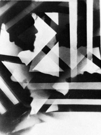
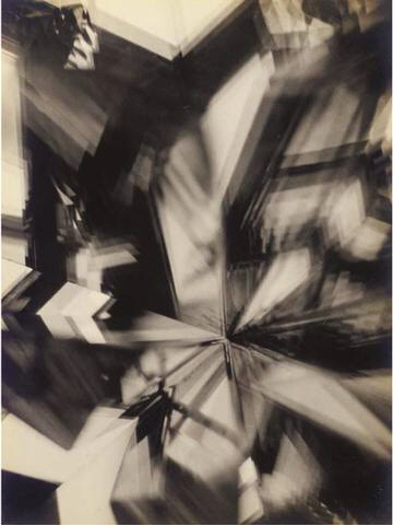
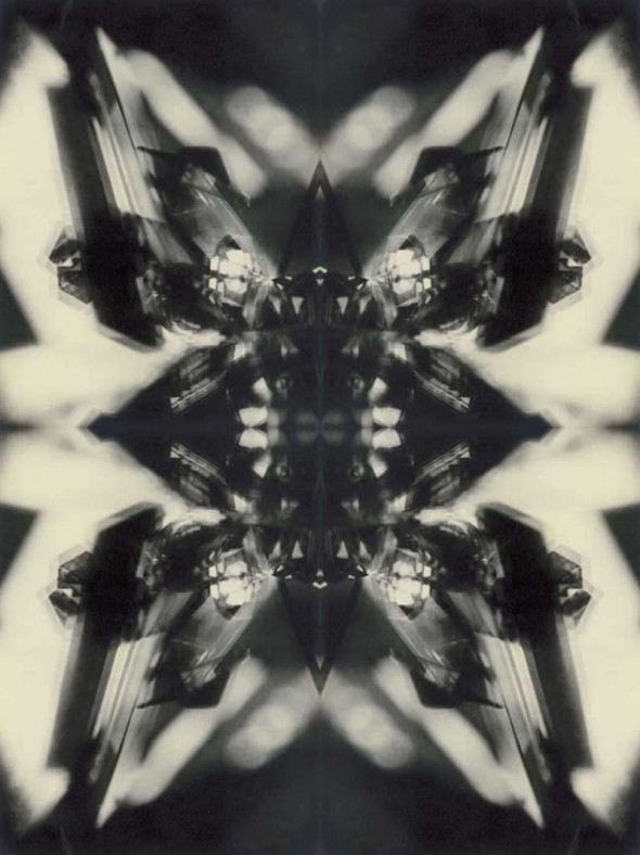
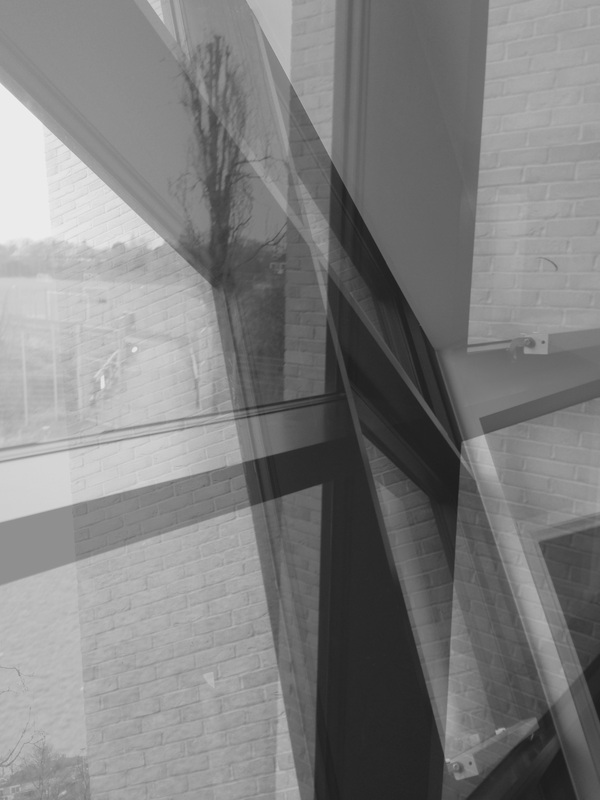
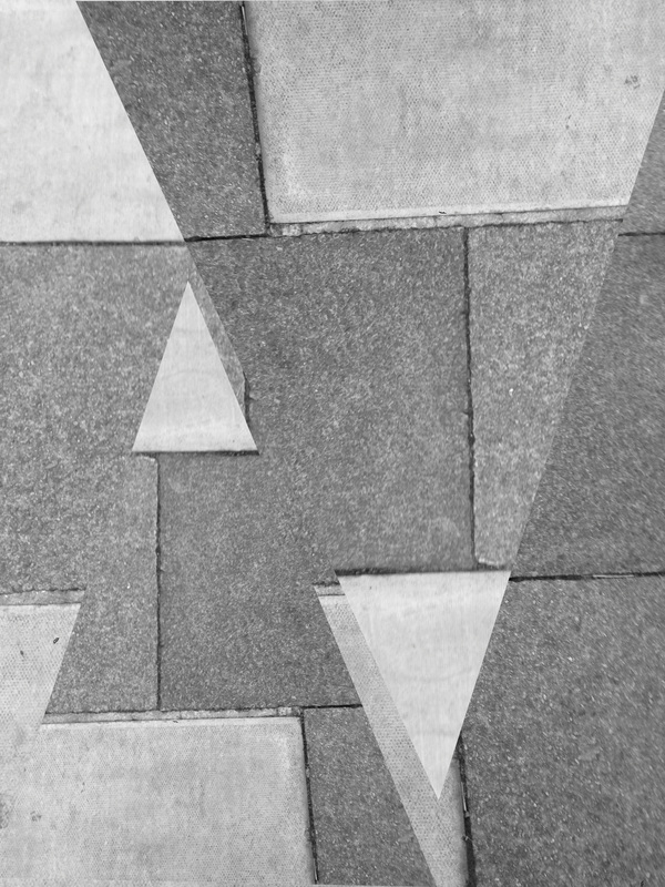
For this project i have researched a few photographers and artists for inspiration for the work i composed, such as Matthew Tischler, Francesca Woodman and Paul Strand. I explored these photographers/artists techniques and photo structures to help me develop an idea of what kind of images that i wanted to elaborate on, being different themes. I mainly focused on the theme of lines and sometimes focus. I was given a photographer by the teacher to research on who was Francesca Woodman and i found her work very interesting and her work related to my theme quite a lot and her exhibition that was called 'Zigzags" really inspired my work. Her work influenced my first and second final pieces because of its simplicity of the lines but still interesting enough. My first piece involved more intricate lines as it has many different angles and tones of the lines.
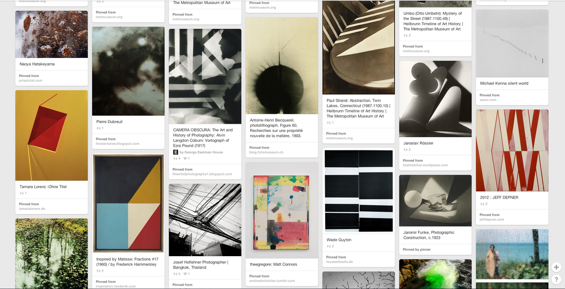
I chose the theme of focus and lines as a starting point. I researched a photographer called Matthew Tischler and i really liked his images based on the theme of focus and i took inspiration from his idea and responded in my own technique, using resources to create a similar effect to what Tischler created. I attempted to develop my response to the theme but ideas were low so i quickly moved onto another theme. To get more inspiration if what i wanted to move into next i looked on the Tallis arts Pinterest board of abstraction. From that i found different artists and their work. I decided to move onto lines because i thought that even though it was a simple idea, you are able to develop it into something more complex.
I went around the school to take more images but this time i would focus on lines and compose my images better. I looked for the most obvious but also hidden lines as i found it more interesting. The images that i took were not massively impressive so i decided to go on photoshop to develop those, i chose two images that were taken in the same area but in different angles and as my result of blending the two i got to my first final piece. Also i thought it was a good idea to add a black and white filter to the blended image because as there were already many lines in the image, to also have the different colours of the background and everything else will make the image too complicated and not very pleasant to look at. I thought to have it black and white would bring the different tones of the two colours to stay within those tones and not several colourful ones.
