Contrast
chiaroscuro - in art is the use of strong contrasts between light and dark, usually bold contrasts affecting a whole composition.
kɪˌɑːrəˈskʊərəʊ/
noun
Artists who are famed for the use of chiaroscuro include Leonardo da Vinci and Caravaggio. Leonardo employed it to give a vivid impression of the three-dimensionality of his figures, while Caravaggio used such contrasts for the sake of drama. Both artists were also aware of the emotional impact of these effects.
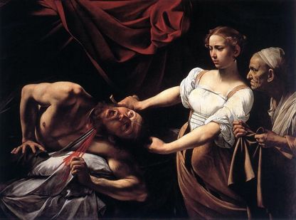
An example of chiaroscuro by Caravaggio. The artist has clearly wanted to focus on the 3 figures and has highlighted that by the way he has painted this image, he has mainly blacked out the background but left some red fabric in the background, maybe to represent the blood that is being drawn as the woman beheads the man.
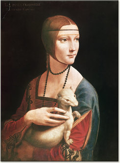
An example of chiaroscuro by Leonardo De Vinci.
He has painted a portrait of the woman holding an animal and has chosen to highlight her out of a blacked out background. It almost looks like it has been edited by cutting it out from a separate image and placed on a black background.
Quoted from Leonardo De Vinci about his technique:
kɪˌɑːrəˈskʊərəʊ/
noun
- the treatment of light and shade in drawing and painting.
- an effect of contrasted light and shadow.
plural noun: chiaroscuros
"the chiaroscuro of cobbled streets"
Artists who are famed for the use of chiaroscuro include Leonardo da Vinci and Caravaggio. Leonardo employed it to give a vivid impression of the three-dimensionality of his figures, while Caravaggio used such contrasts for the sake of drama. Both artists were also aware of the emotional impact of these effects.
An example of chiaroscuro by Caravaggio. The artist has clearly wanted to focus on the 3 figures and has highlighted that by the way he has painted this image, he has mainly blacked out the background but left some red fabric in the background, maybe to represent the blood that is being drawn as the woman beheads the man.
An example of chiaroscuro by Leonardo De Vinci.
He has painted a portrait of the woman holding an animal and has chosen to highlight her out of a blacked out background. It almost looks like it has been edited by cutting it out from a separate image and placed on a black background.
Quoted from Leonardo De Vinci about his technique:
“I would remind you O Painter! To dress your figures in the lightest colors you can, since, if you put them in dark colors, they will be in too slight relief and inconspicuous from a distance. And this is because the shadows of all objects are dark. And if you make a dress dark there is little variety between the lights and shadows, while in light colors there will be greater variety.”
|
|
First Response

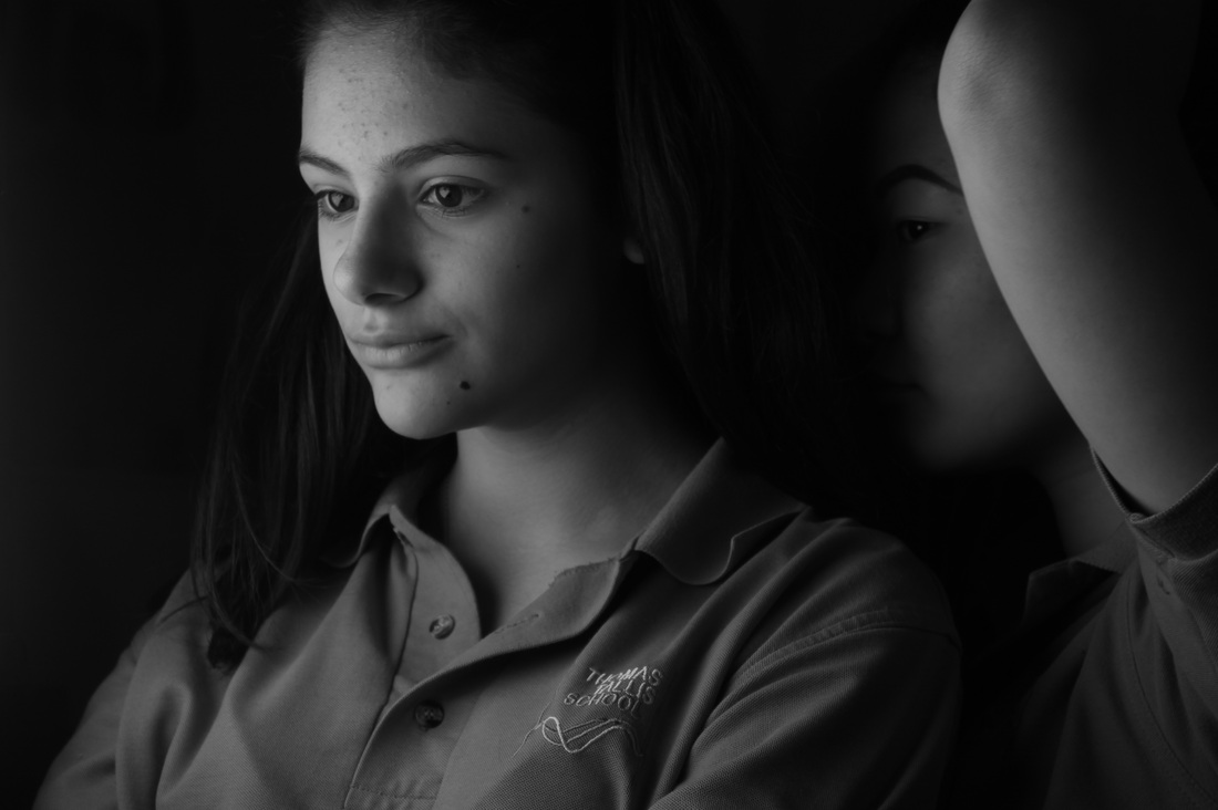
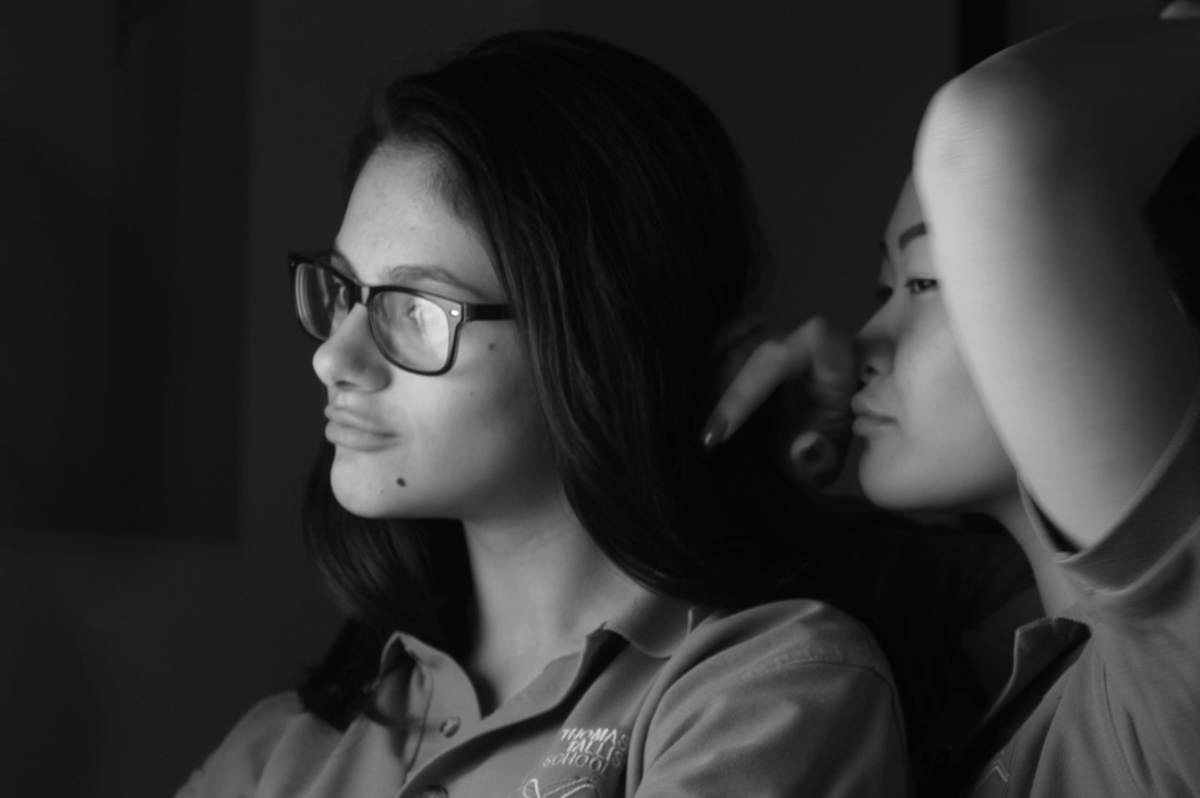
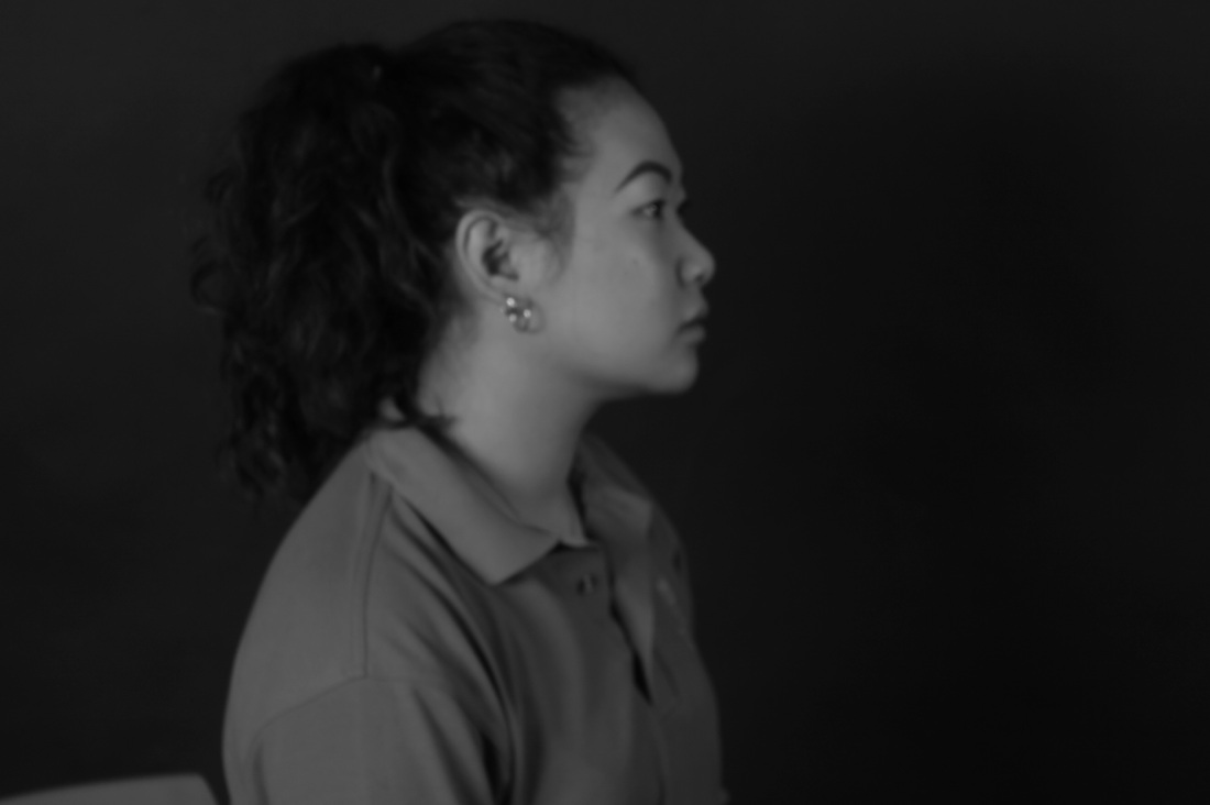
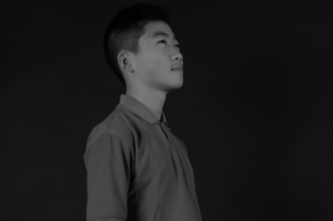
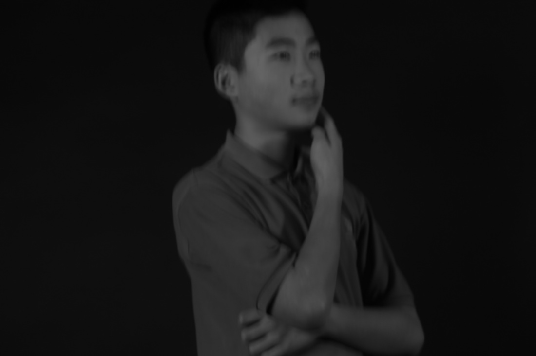
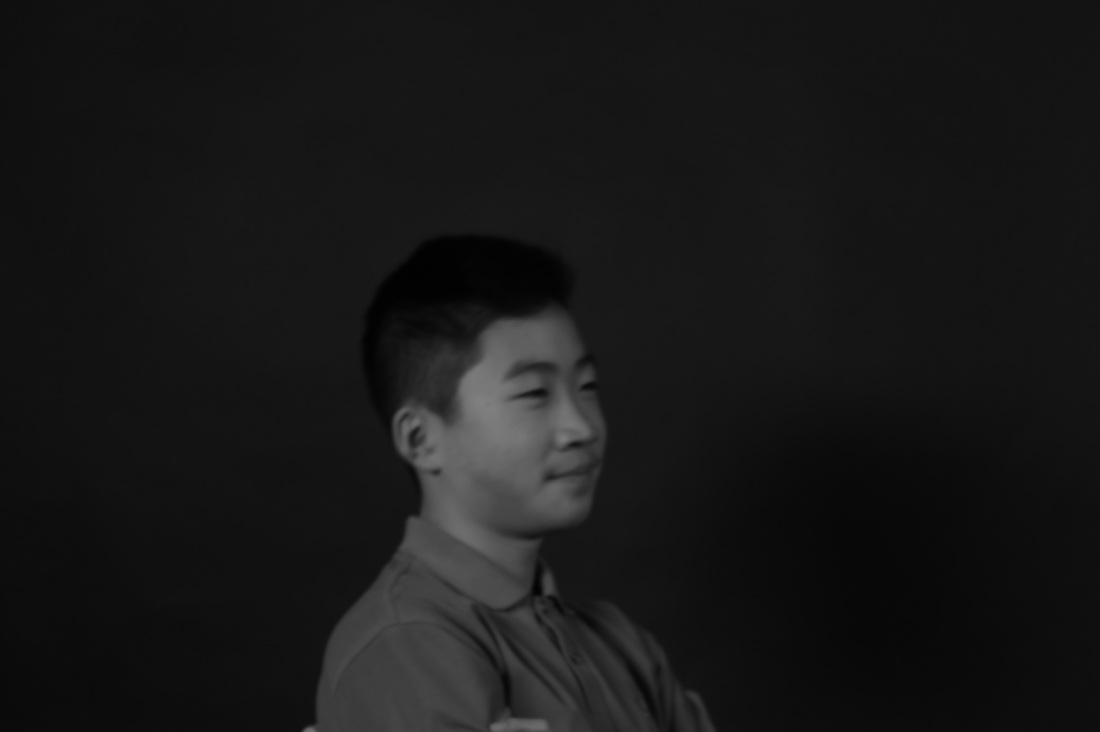
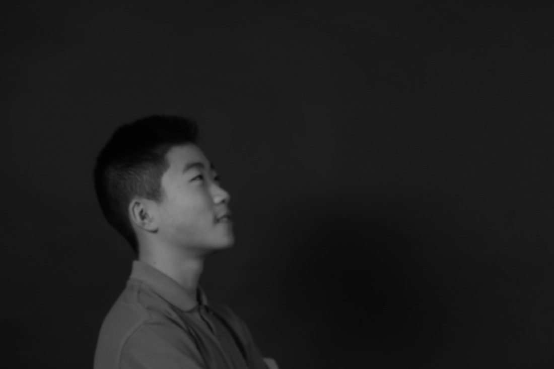
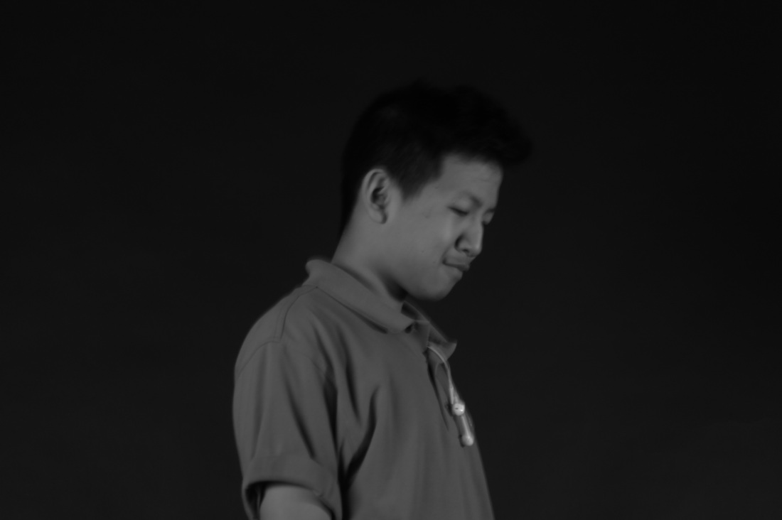
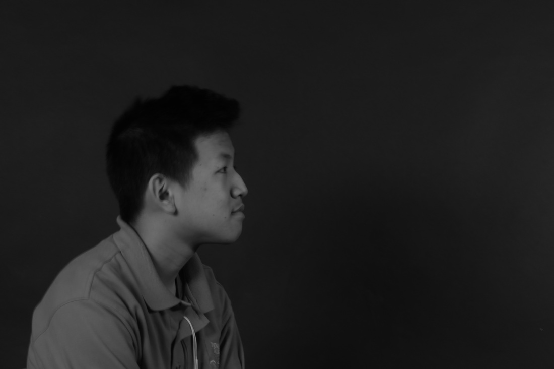
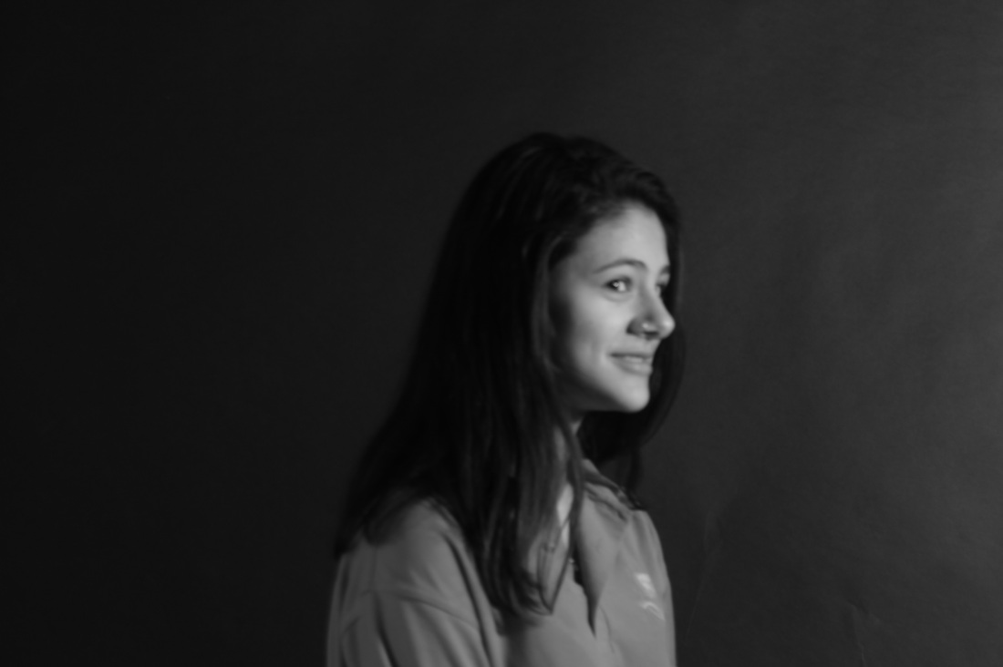
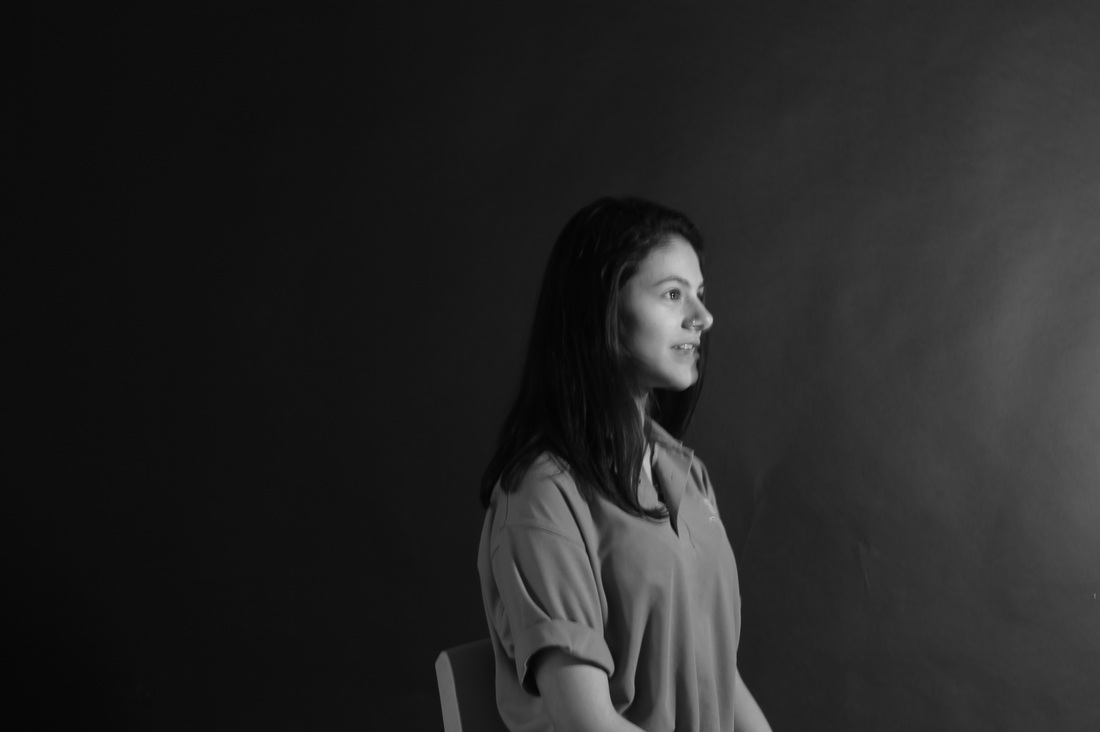
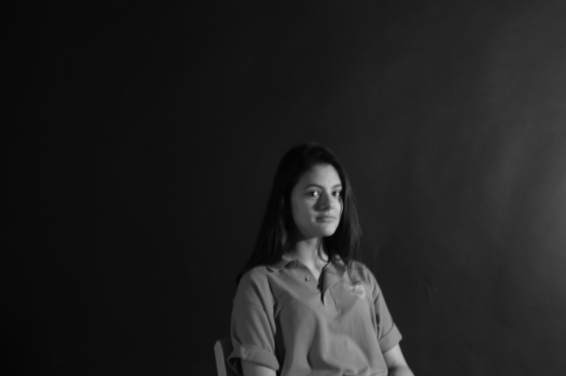
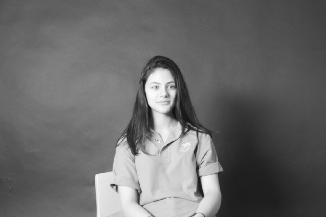
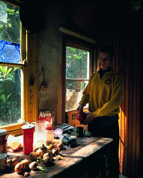
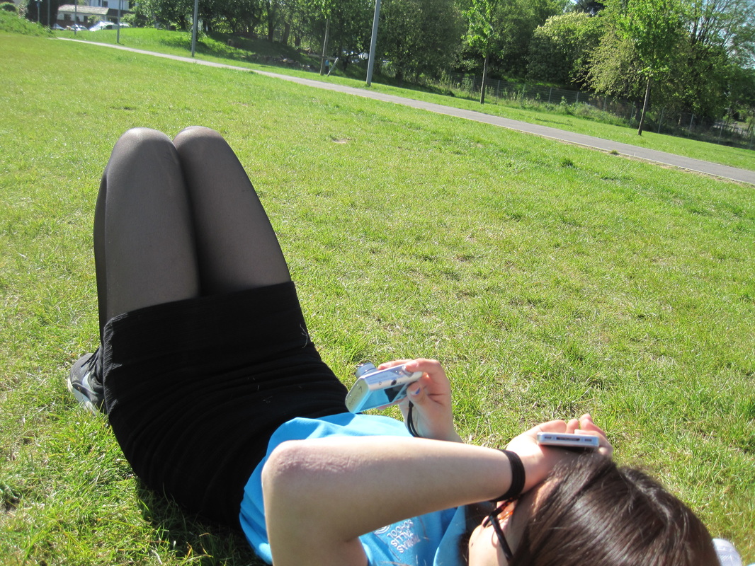
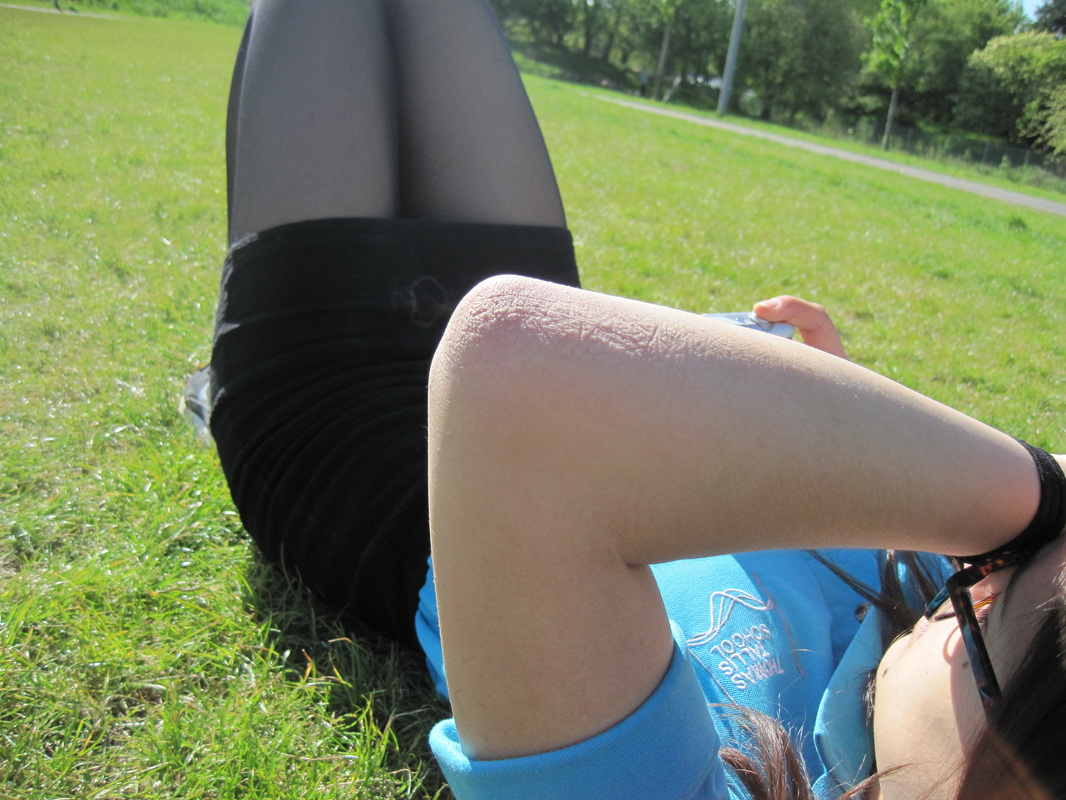
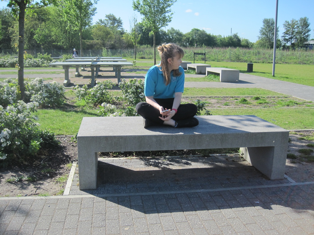
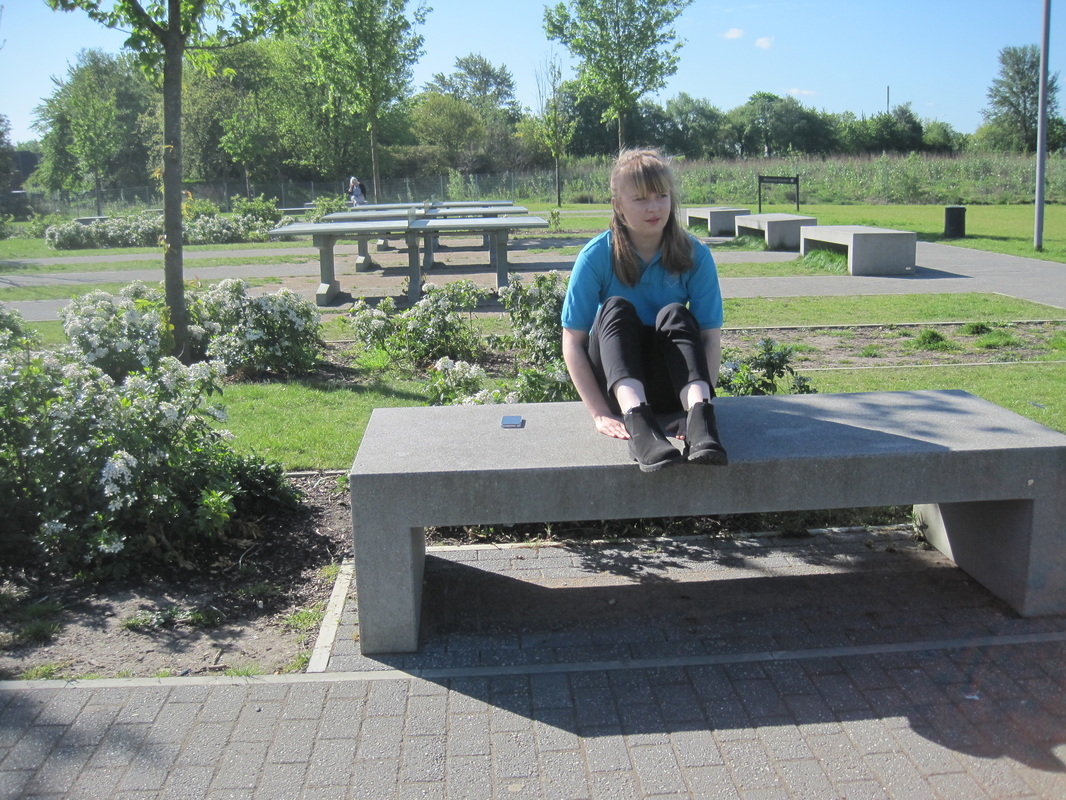
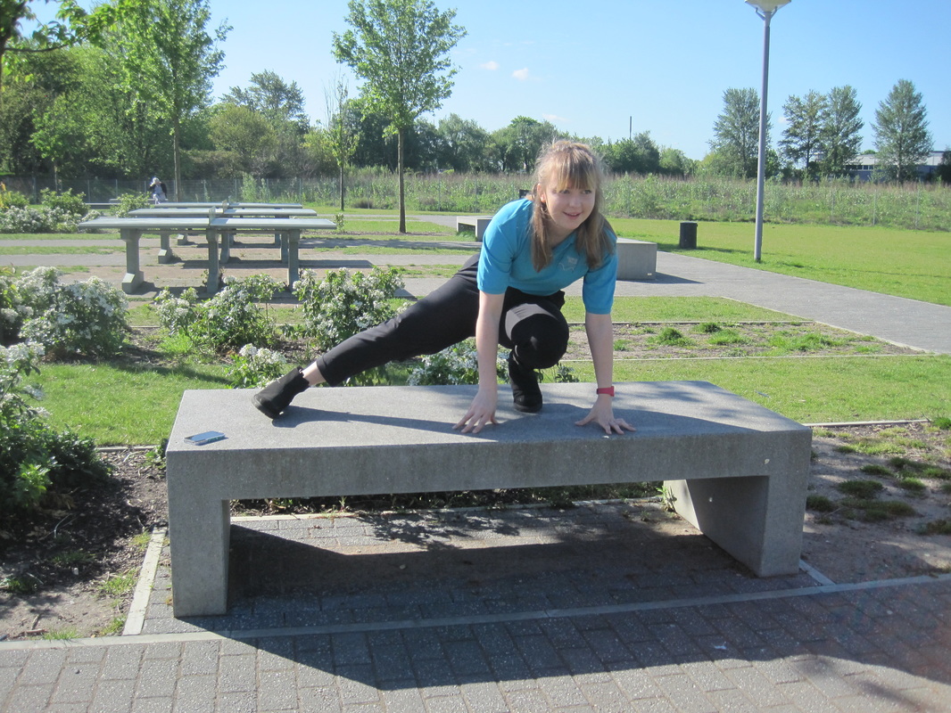
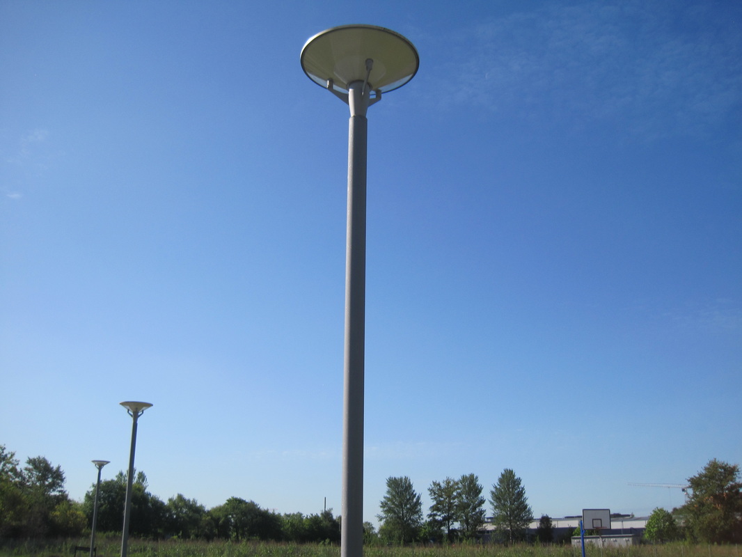
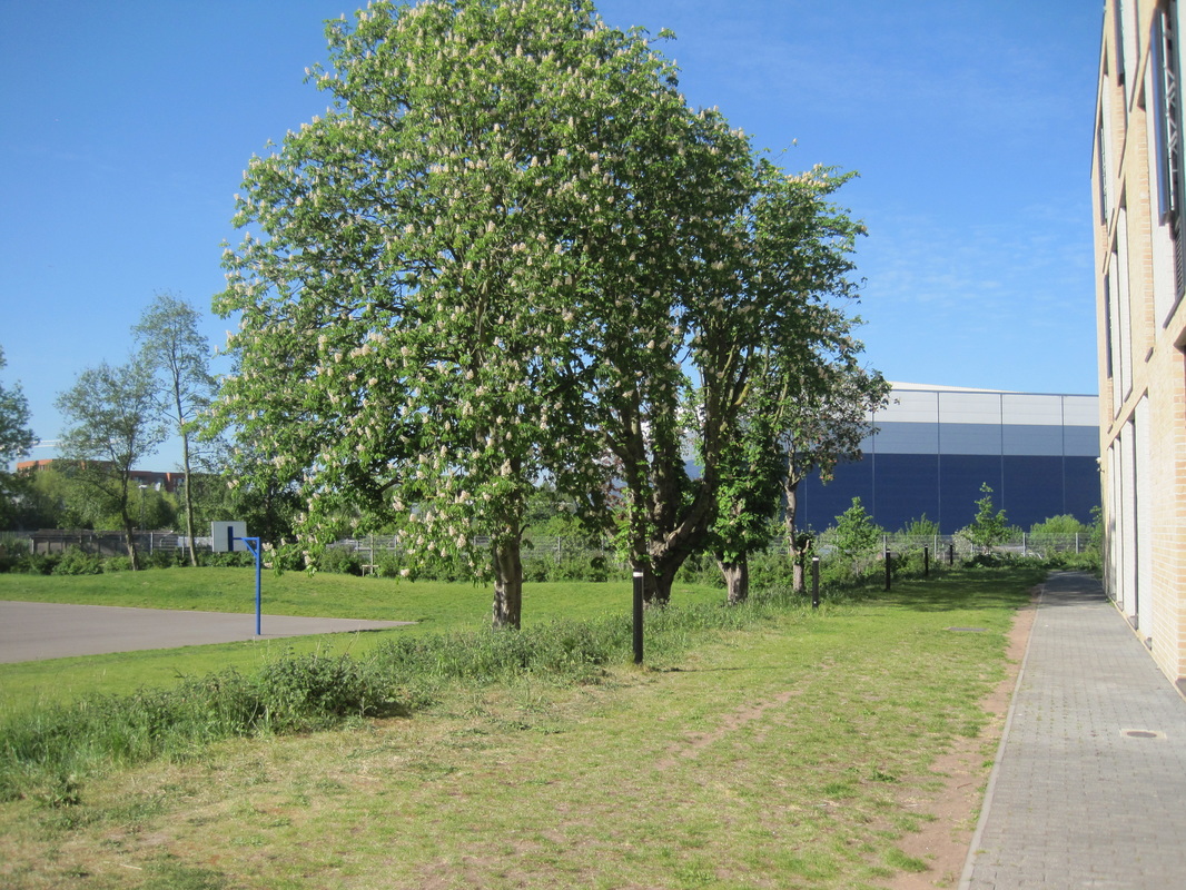
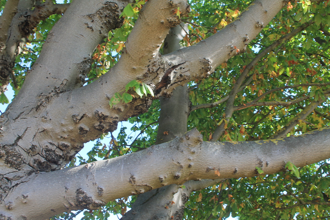
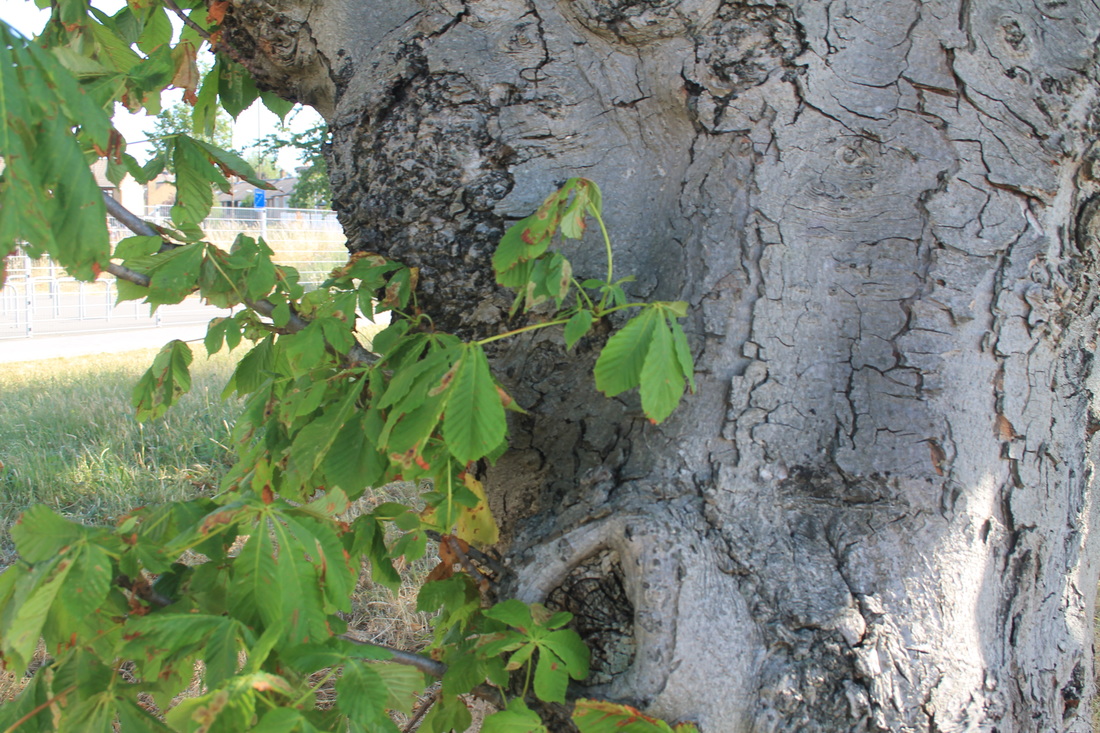
WWW: we managed to understand how it all worked and we were able to figure out what we needed to do and fix to be able to get the outcomes of our images. i think we worked well together and i enjoyed this task, we started off quite unsure but gradually worked well in the end. There were many bad images that didn't work as it was too exposed or too dark but a few attempts it was better. I also liked the independence we got with this task as it showed we could solve problems without ms constantly having to tell us what to do and being able to get on with it as a group.
EBI: if we had more time to focus on this because i really enjoyed this task and would've liked more time on it
EBI: if we had more time to focus on this because i really enjoyed this task and would've liked more time on it
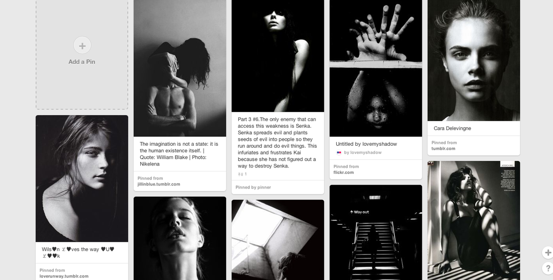
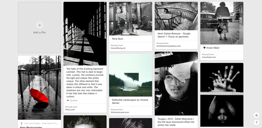
Chiaroscuro on Pinterest
|
Elliot Erwitt |
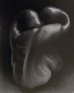
Edward Weston - Pepper 1930
The focal point of the photograph confused me, because I couldn’t decide what it was, i thought it was a tongue and once I knew it was a pepper it still didn't really make sense that it was a pepper. because of its distorted structure i couldn't see the pepper. It has a monochromatic colour scheme, and it’s simple, yet complex design. This image includes the use of form, colour, value, space and contrast. The use of form is obvious in this image, because the focal object is very real looking and it has lots of depth to it. Weston effectively combines colour, value and contrast, because the monochromatic colour scheme combined with a large range of value and contrast (light and dark), all work together to emphasise the twists and curves of the pepper.
"It was a bright idea, a perfect relief for the pepper and adding reflecting light to important contours. I still had the pepper which caused me a week's work, I had decided I could go no further with it, yet something kept me from taking it to the kitchen, the end of all good peppers. I placed it in the funnel, focused with the Zeiss, and knowing just the viewpoint, recognizing a perfect light, made an exposure of six minutes, with but a few moments' preliminary work, the real preliminary was on in hours passed. I have a great negative, ‒ by far the best!
It is a classic, completely satisfying, ‒ a pepper ‒ but more than a pepper; abstract, in that it is completely outside subject matter. It has no psychological attributes, no human emotions are aroused: this new pepper takes one beyond the world we know in the conscious mind.
To be sure, much of my work has this quality...but this one, and in fact all of the new ones, take one into an inner reality, ‒ the absolute, ‒ with a clear understanding, a mystic revealment. This is the "significant presentation" that I mean, the presentation through one's intuitive self, seeing "through one's eyes, not with them": the visionary."
Tom Hunter - Persons Unknown
"Here, the eponymous ones are everyday folk. Frozen in stasis, and caught in seemingly private moments, they are strangely familiar to us despite the emphasis to the contrary suggested by the title. These images have an immediacy which resonates with our universal experience -e.g. discernible feelings of isolation, of insignificance; anxieties and desires."
I really liked Tom Hunter's persons unknown. I found his images very intriguing and that he uses natural tones to express chiaroscuro instead of using black white to emphasise on the tones that the black white would of showed. But he does it with the surrounding colours with only the light and composing of the camera.
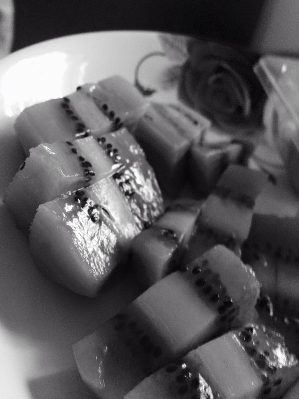
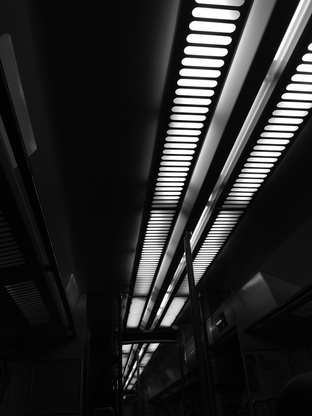
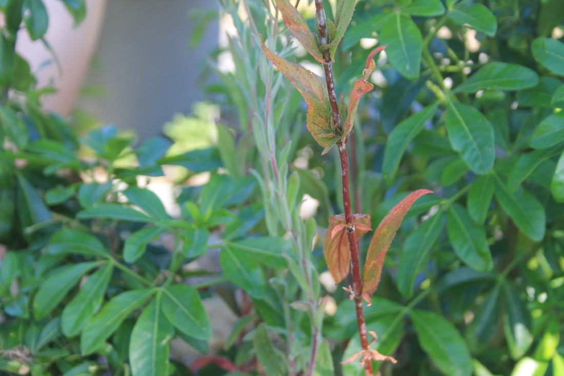
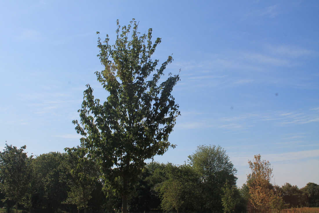
This was a homework task that i didn't focus on as much as i'd like to. it wasn't thought about and quite. I would've like to focus on one subject instead of something different for each one. This task was more forced than me wanting to put the effort into taking the images and thinking about what i wanted to do. Although i do like the image of the kiwis and i thought it showed a contrast between light and dark.
Daido Moriyamais a Japanese photographer noted for his images depicting the breakdown of traditional values in post-war Japan. Daido photographed the urban scenes of his surroundings, he mainly took pictures of anything.
My favourite image of his is the one of the cheetah against the window of the cartier store. Its an interesting contrast because its a cheetah looking at very expensive jewellery and you wouldn't expect anything like that at all. |
|
First Response
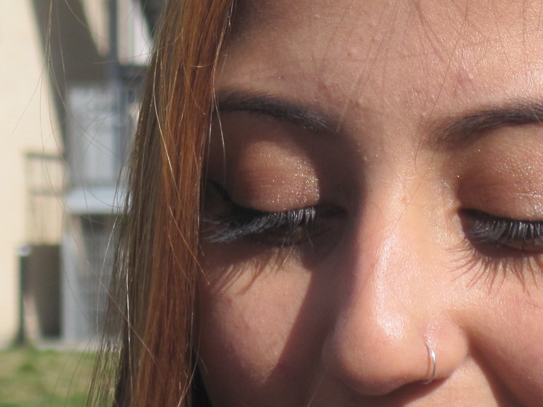
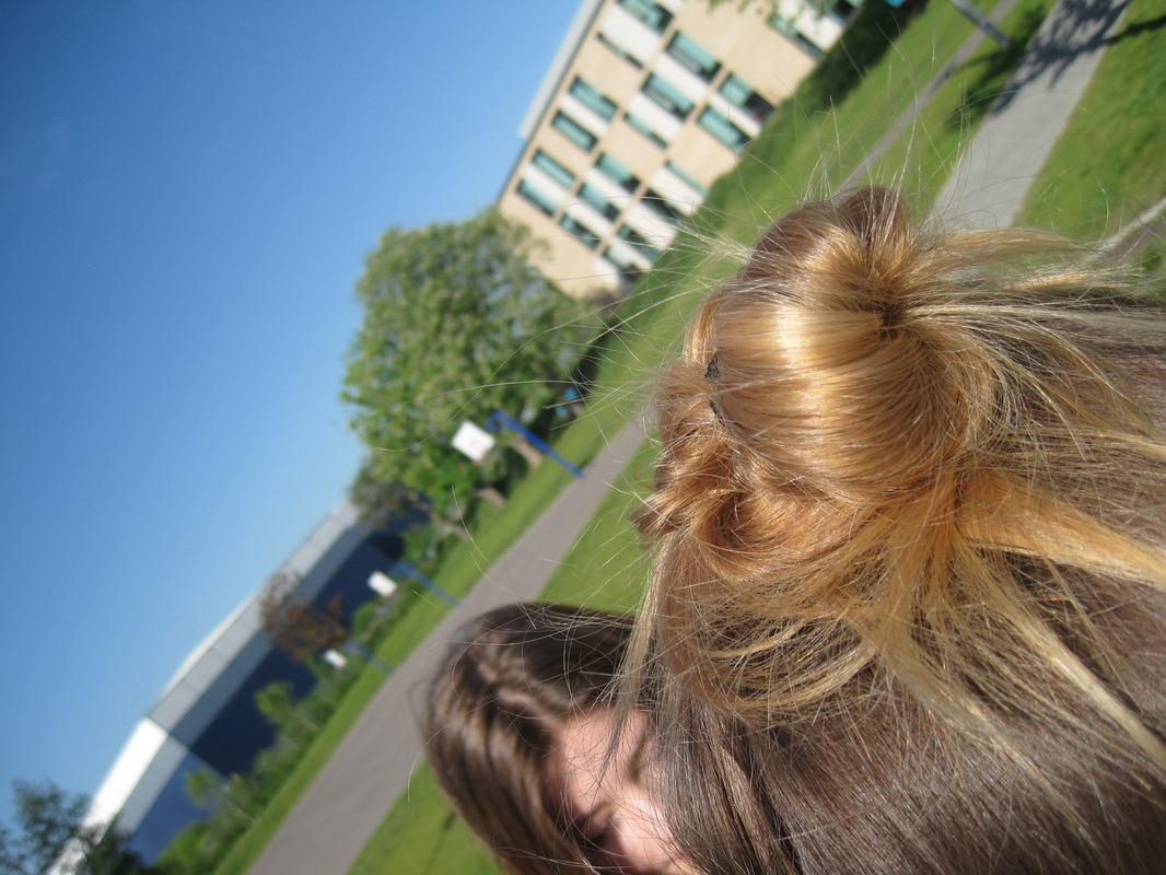
I took most images so i could develop most of them on photoshop, although i didn't use many on photoshop using only about 5. Im not as impressed with the images as i thought i could focused on each individual instead of having loads of images.
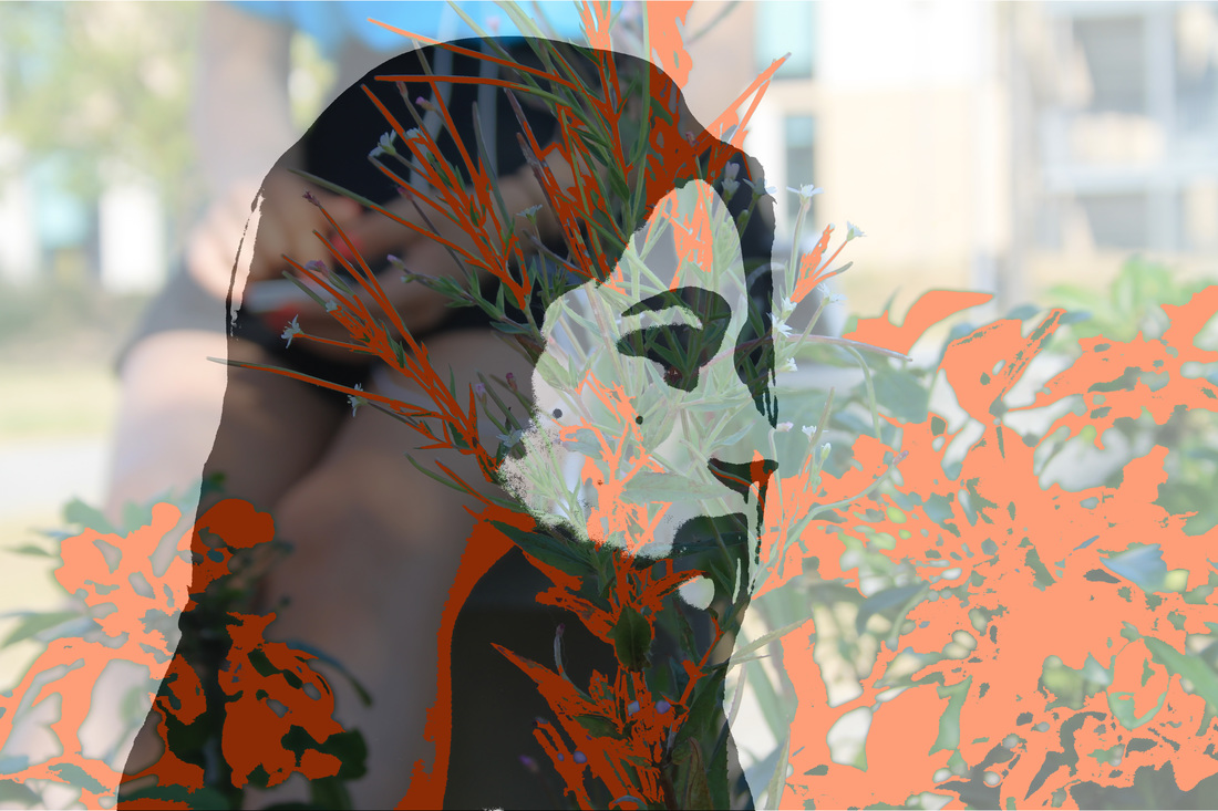
photoshop responses
i played around with these images on photoshop but i wasn't happy with the outcome and i didn't choose any for one of my final pieces
for these images i felt that it wasn't developed enough
Second Response
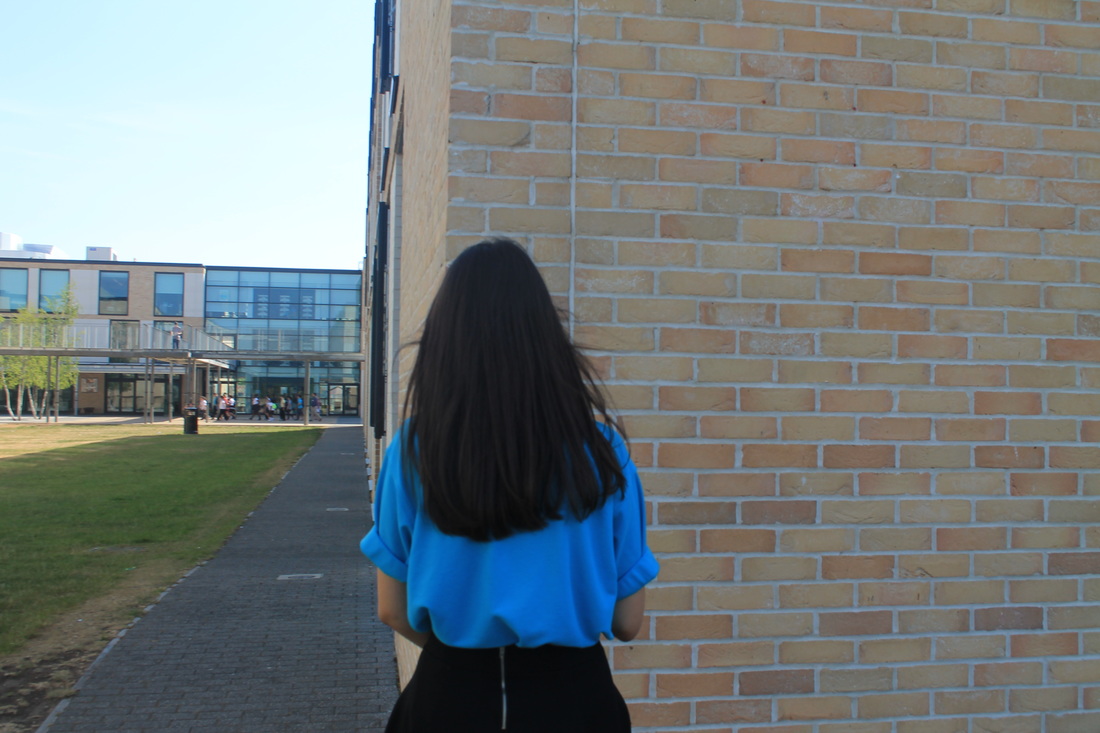
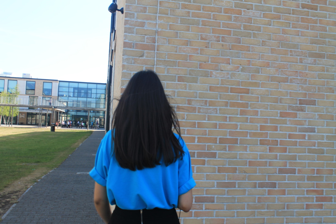
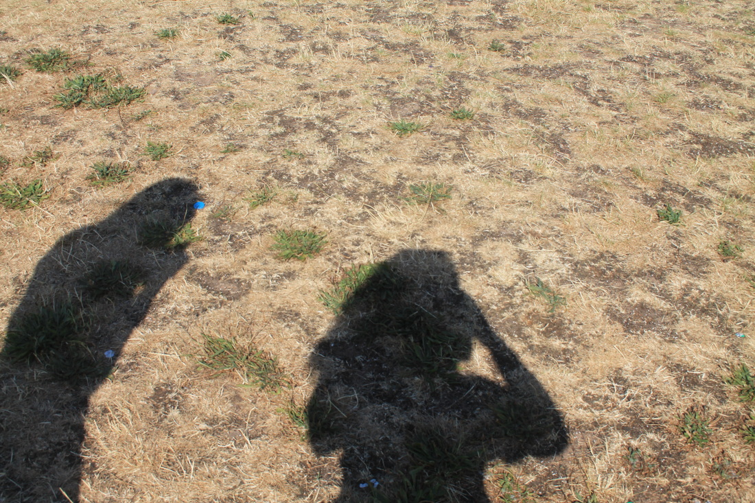
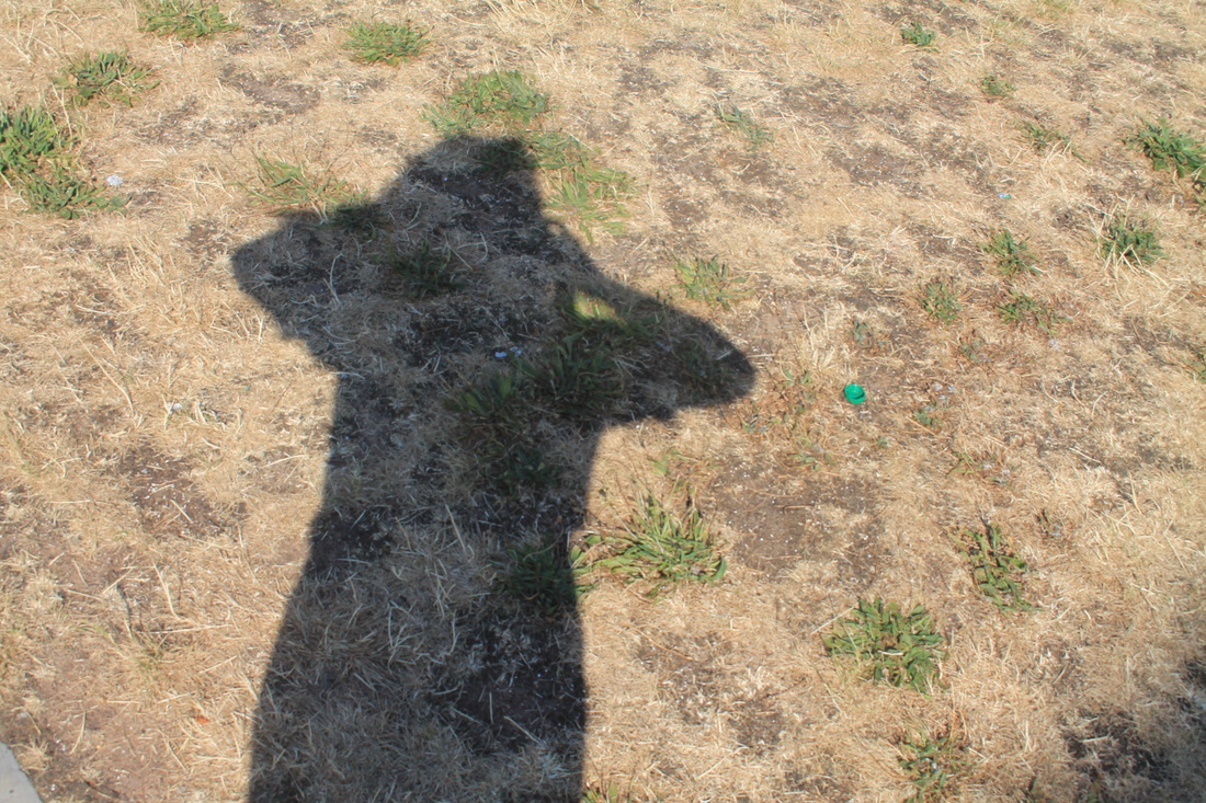
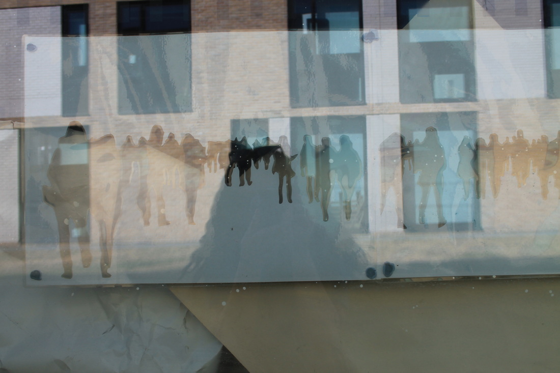
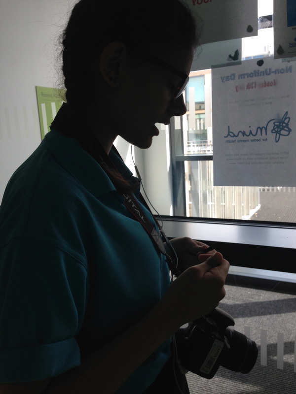
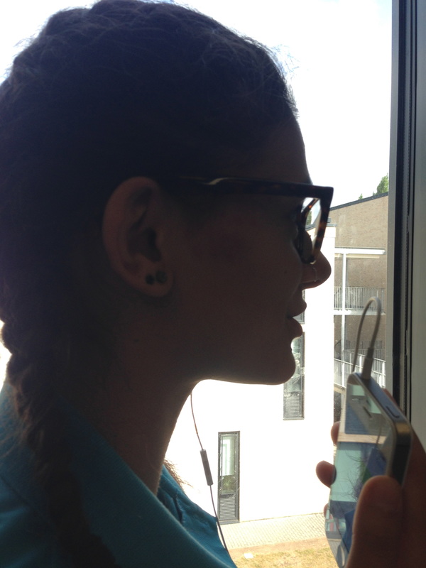
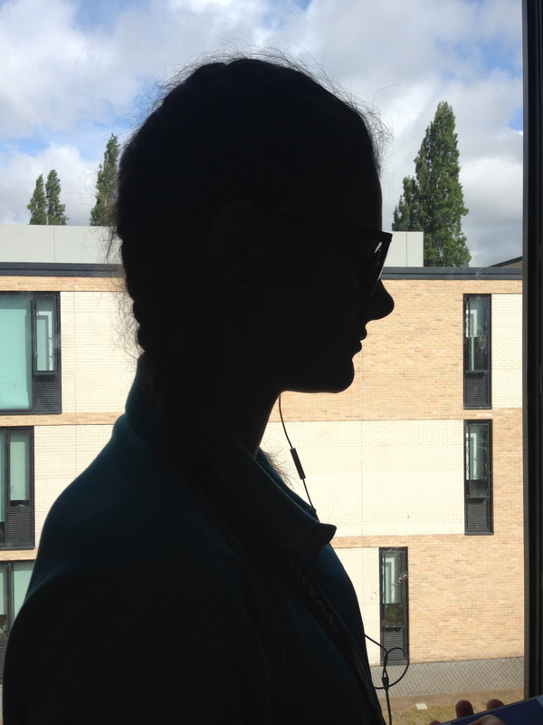
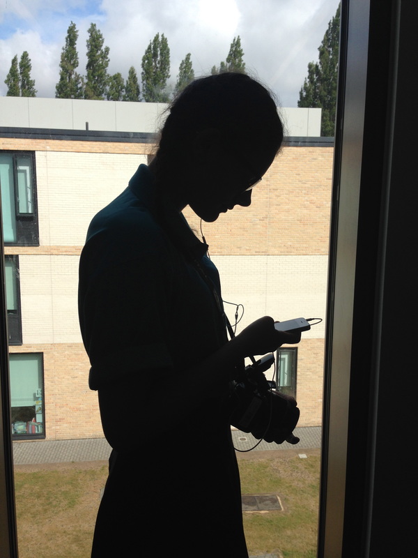
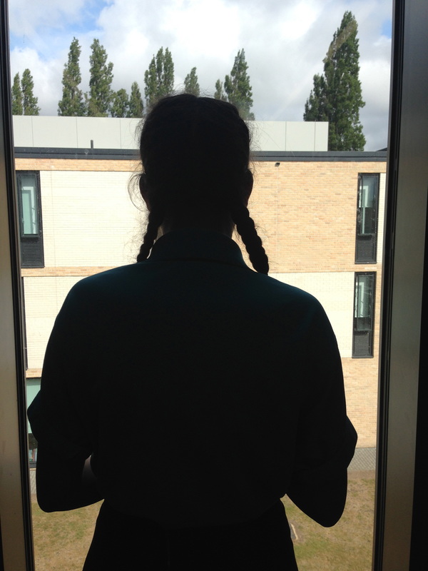
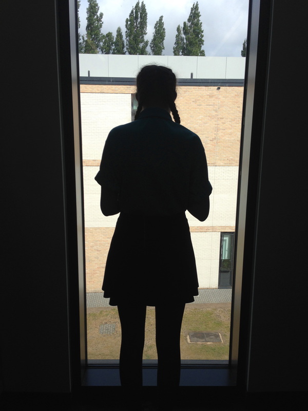
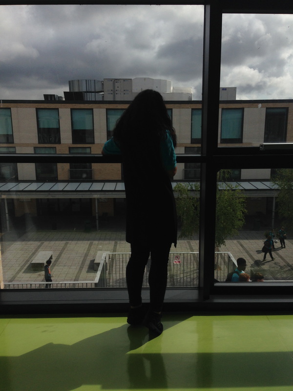
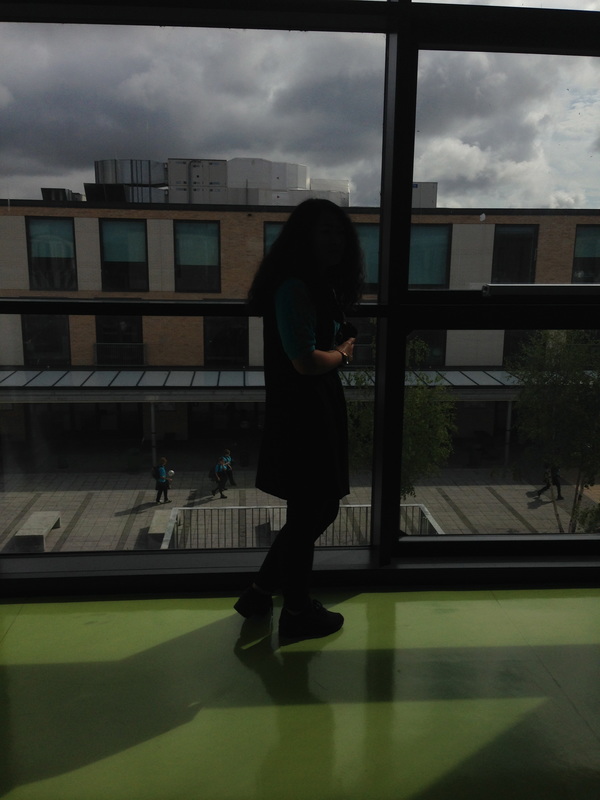
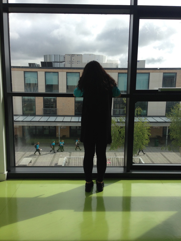
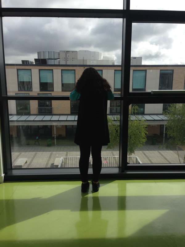
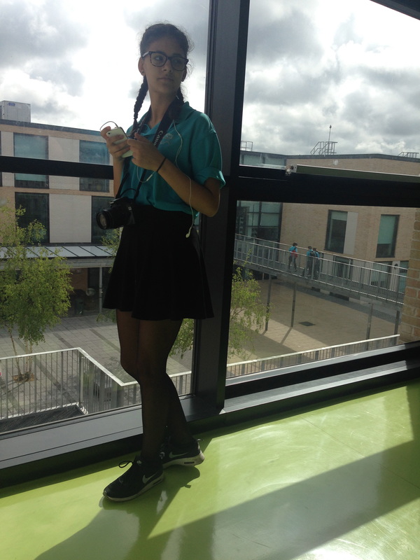
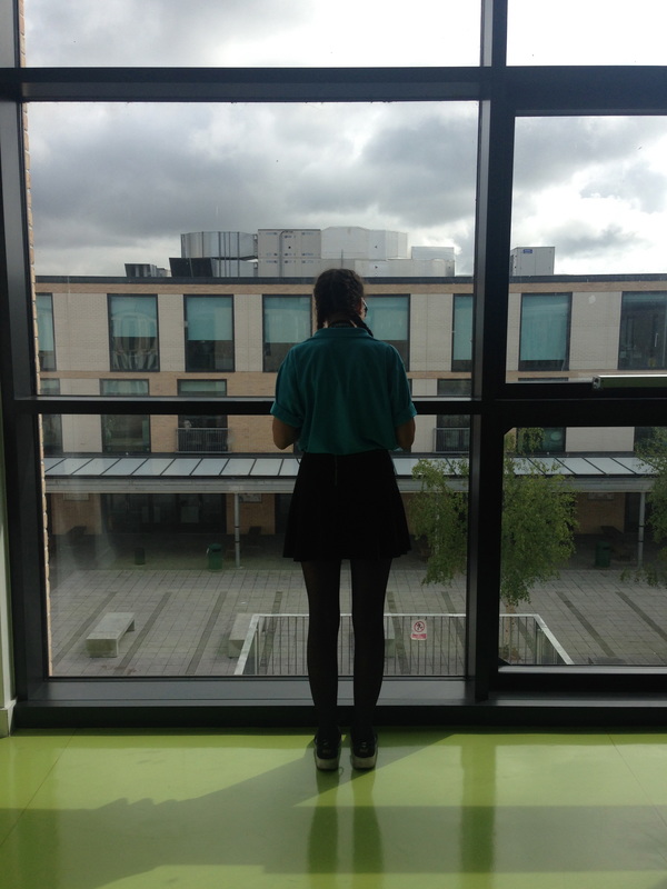
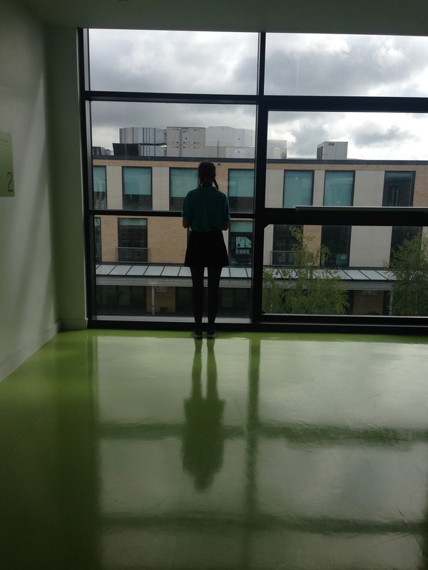
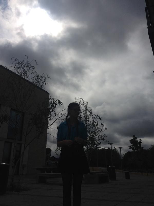
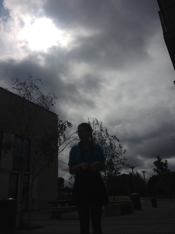
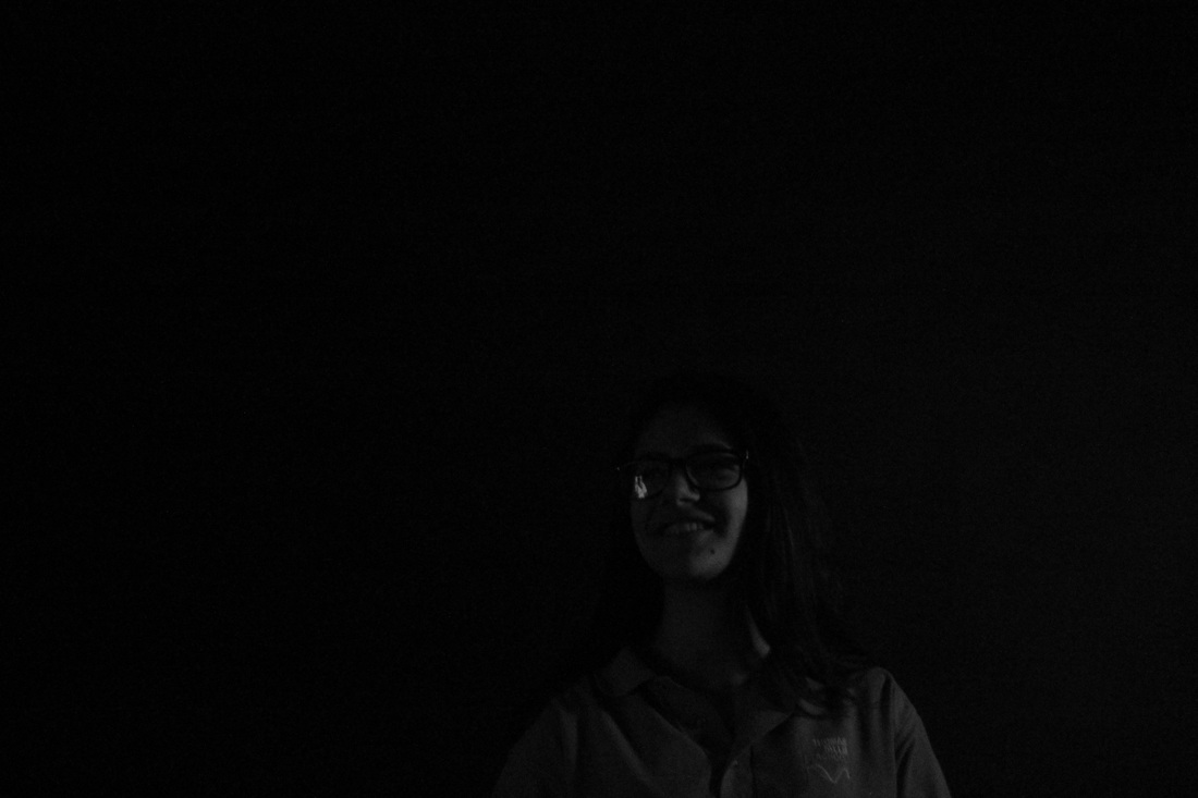
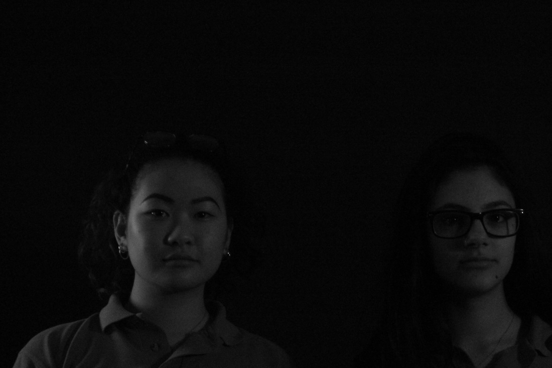
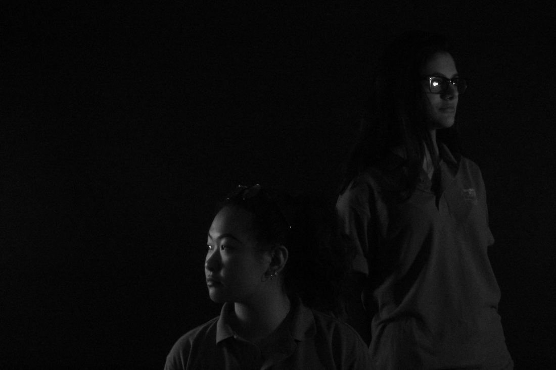
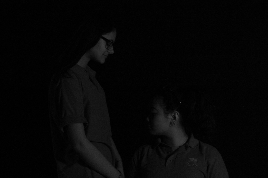
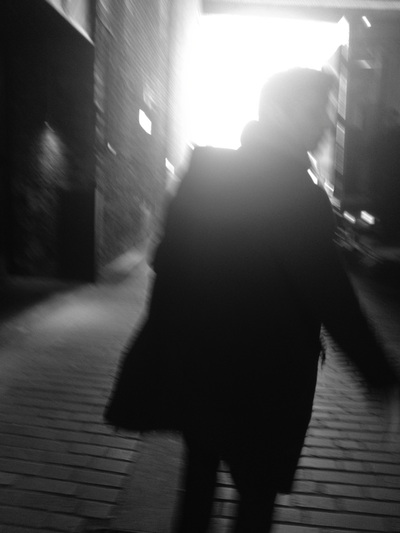
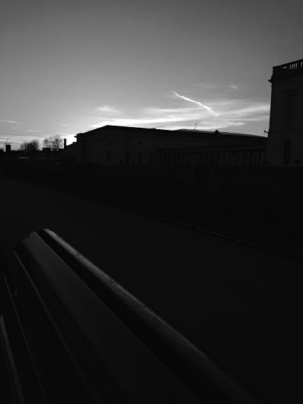
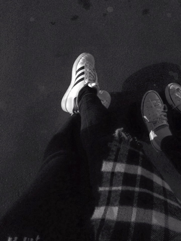
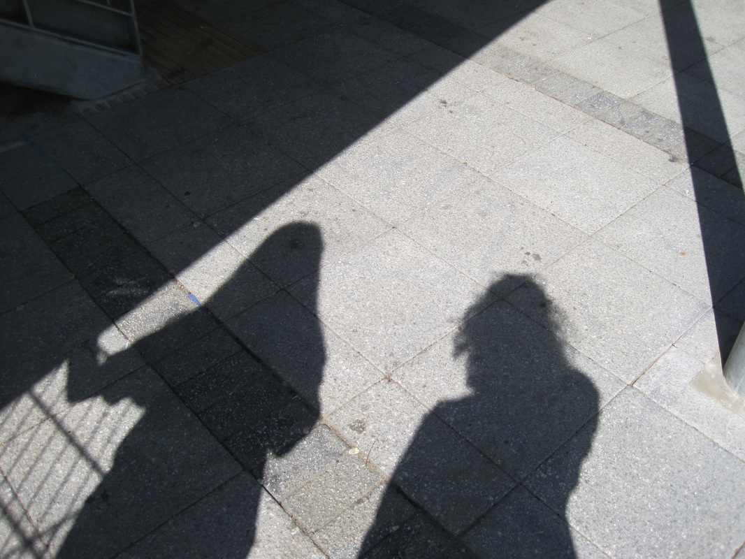
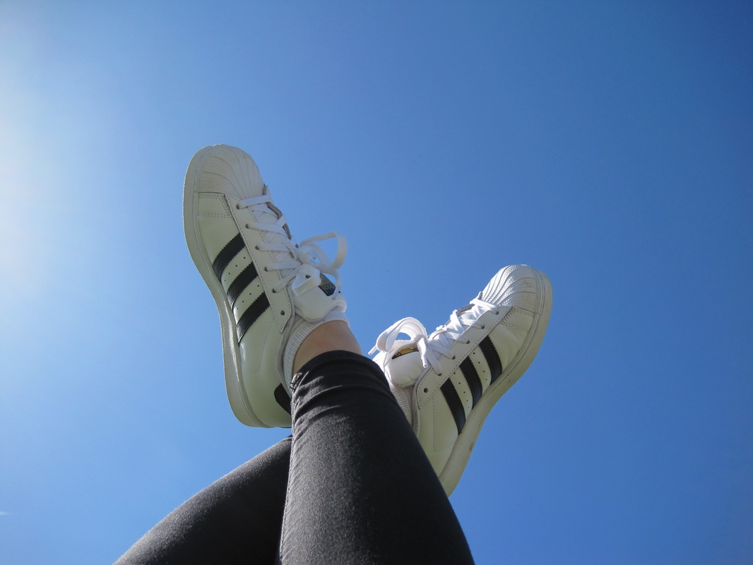
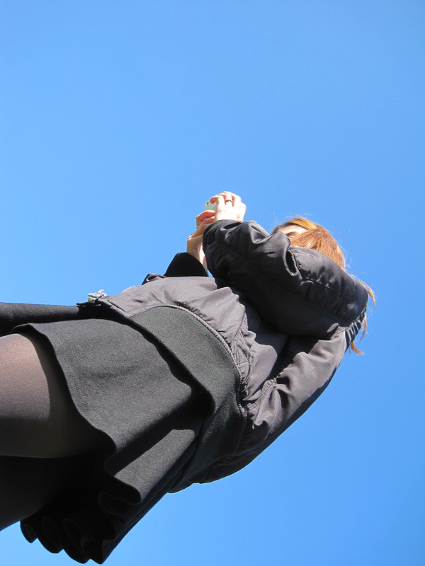
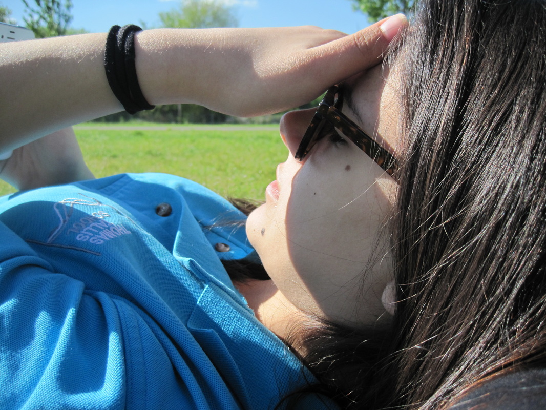
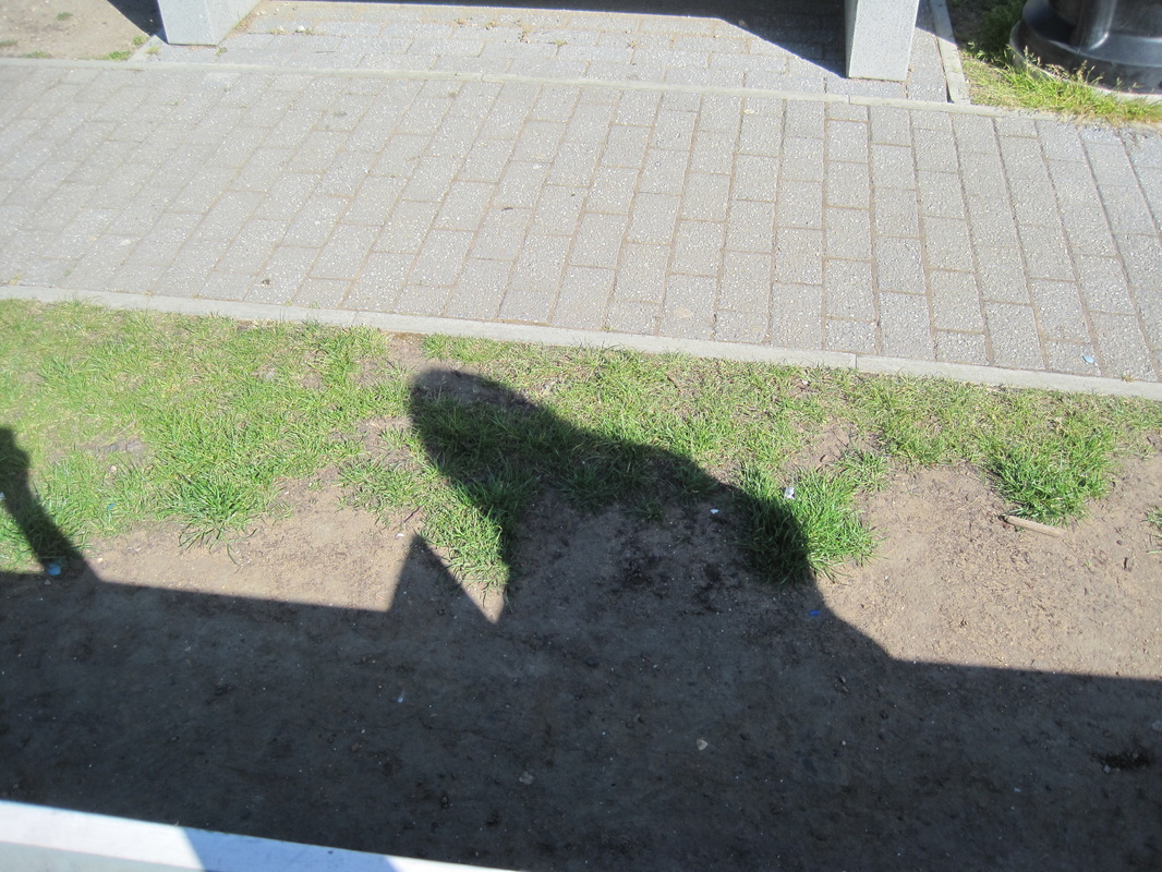
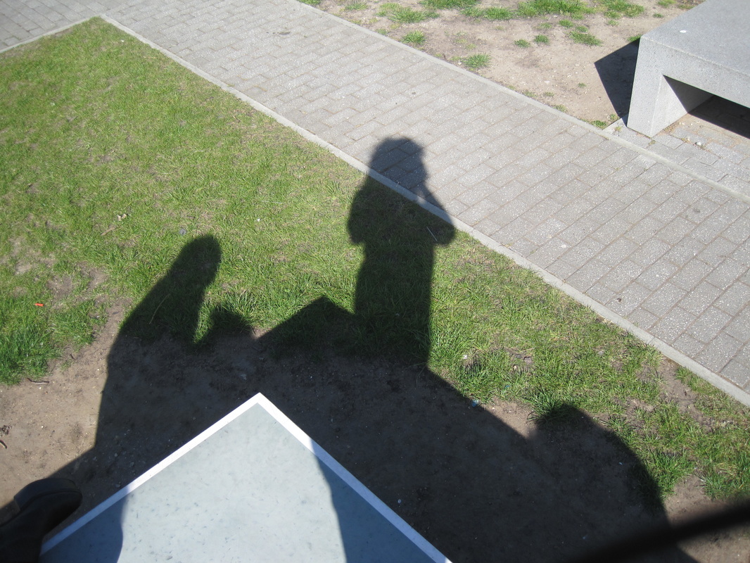
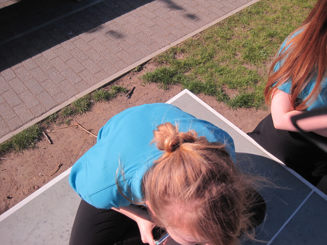
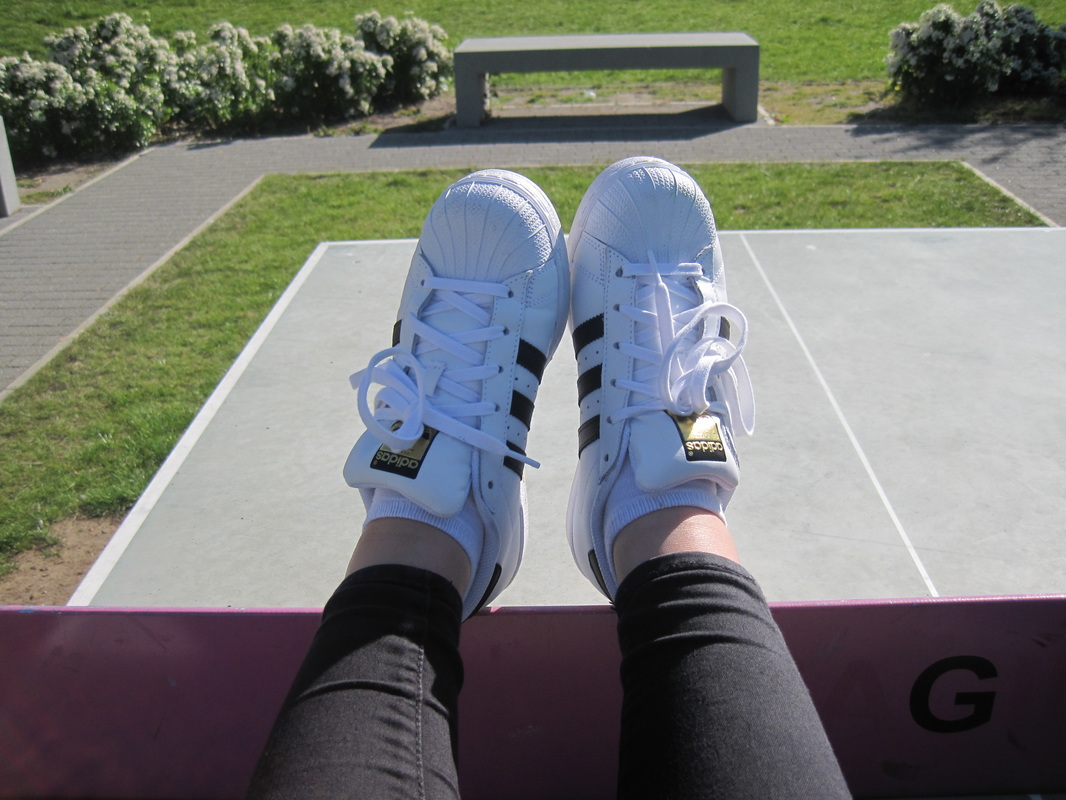
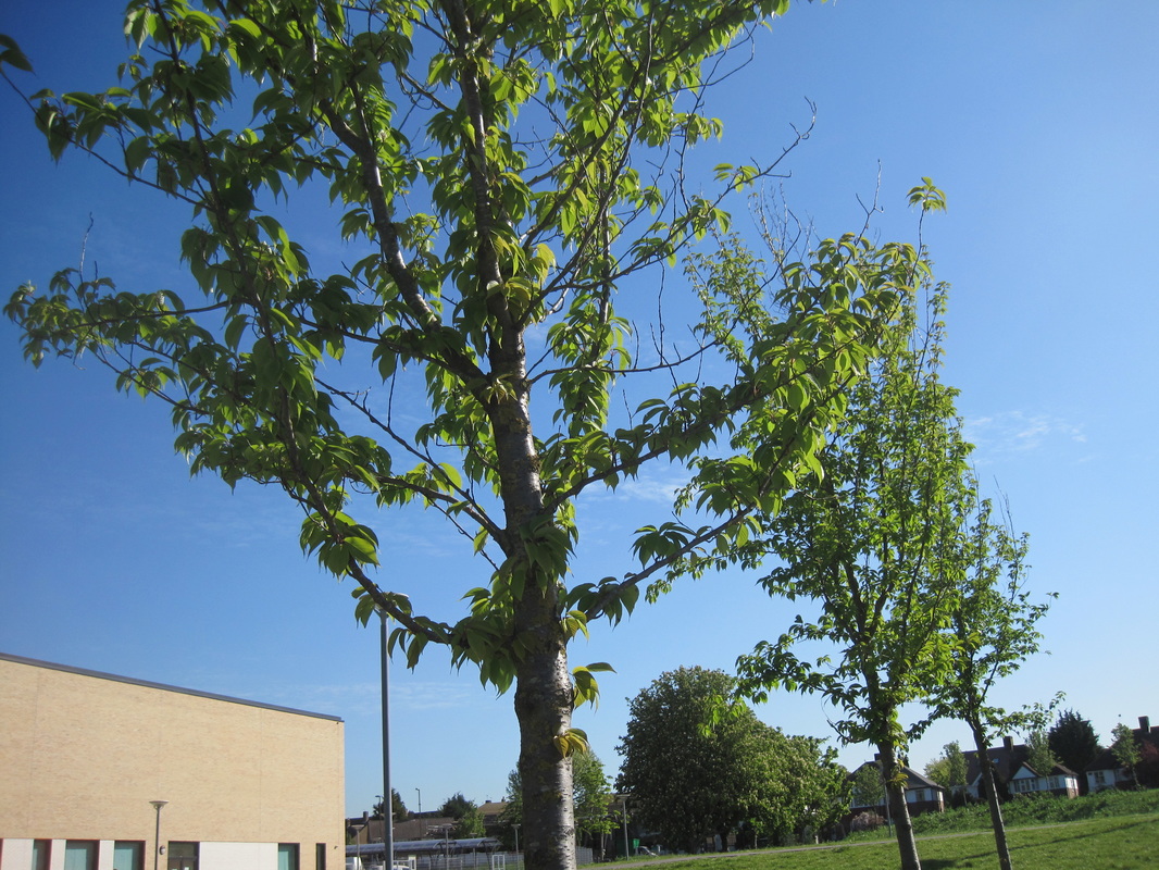
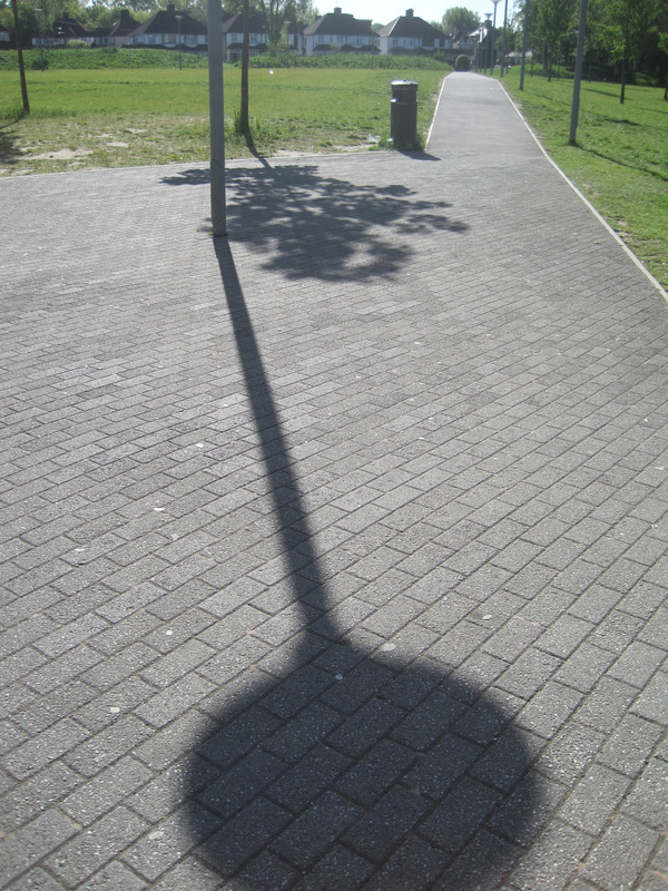
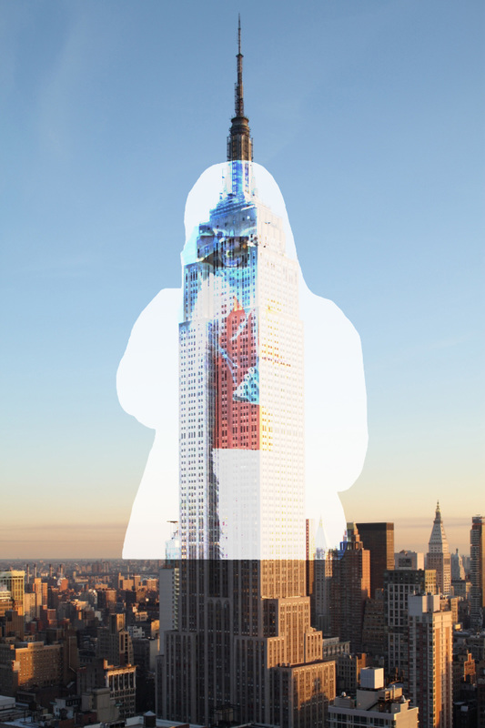
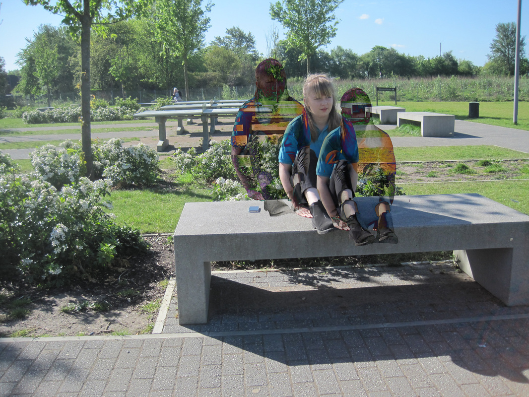
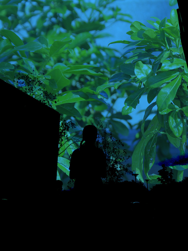
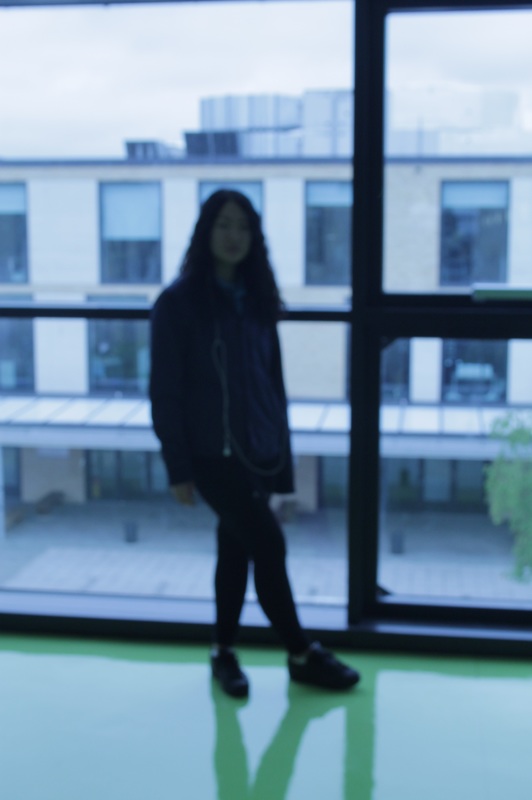
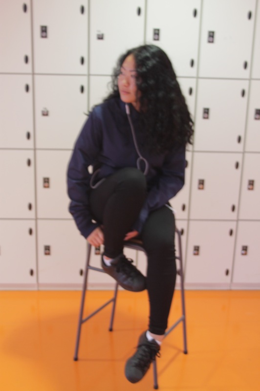
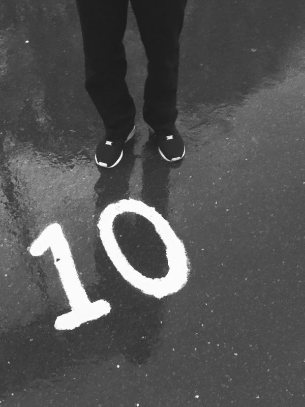
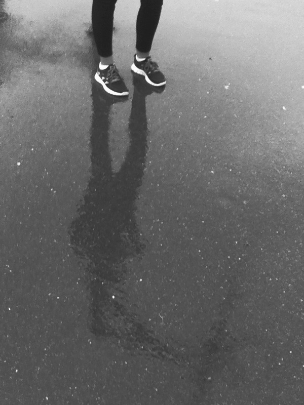
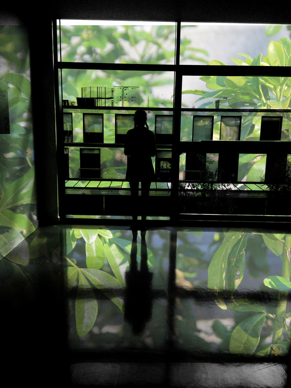
This was my first attempt at silhouettes which i enjoyed doing and learned how to use my iPhone to create those. i feel that silhouettes is a big part in contrast and you can capture really different images. It was a really cloudy dull day when i took these images which made them quite dark but i liked it. My favorite image is the last two with the girl and the building darkened but still able to see what is what.


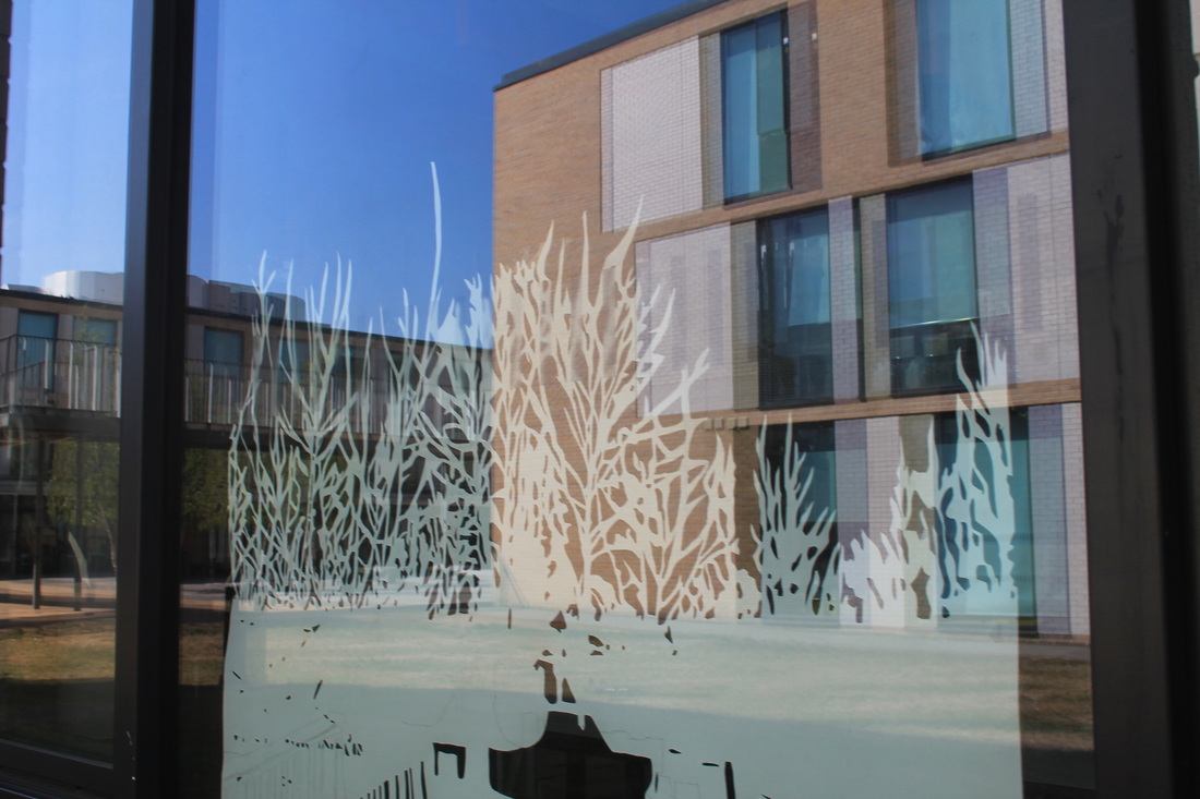
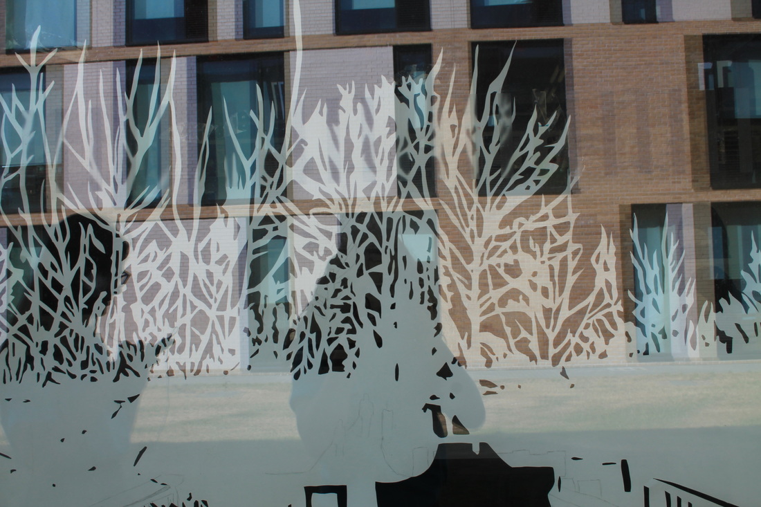
These images edited on photoshop using previous images of my experiments, all images were of my own.
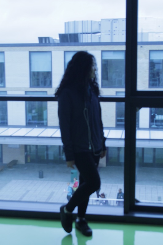
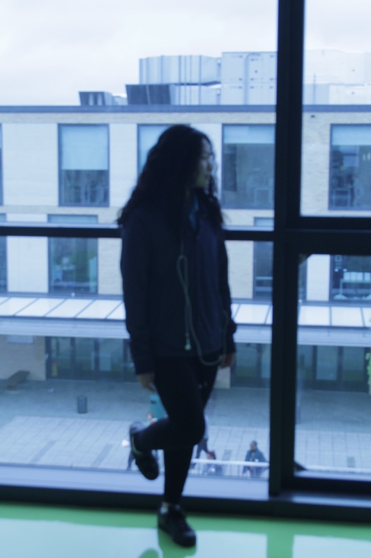
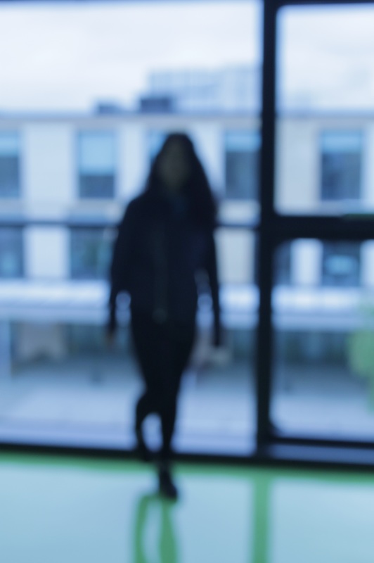
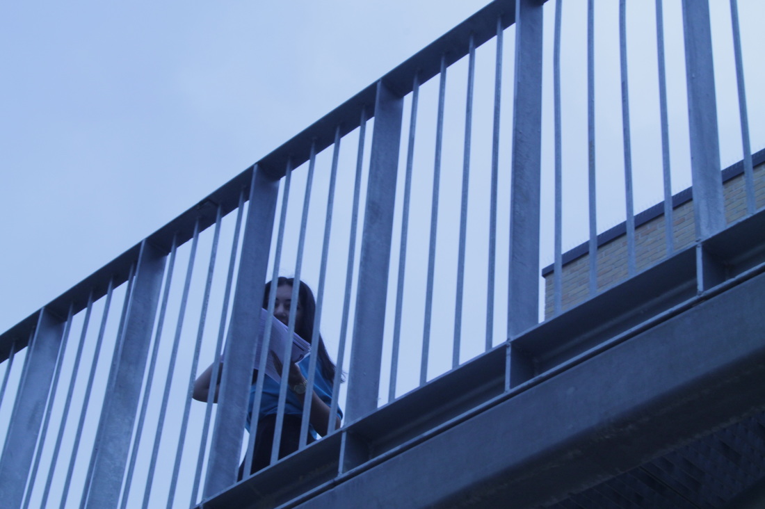
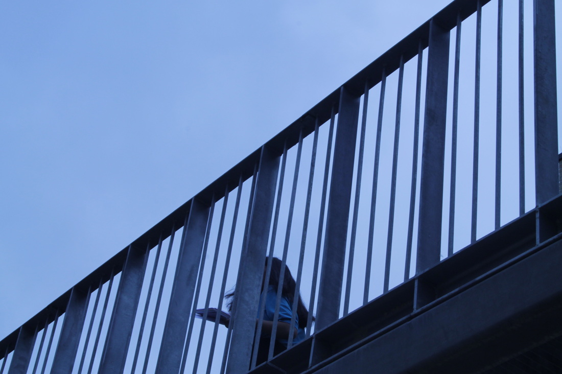
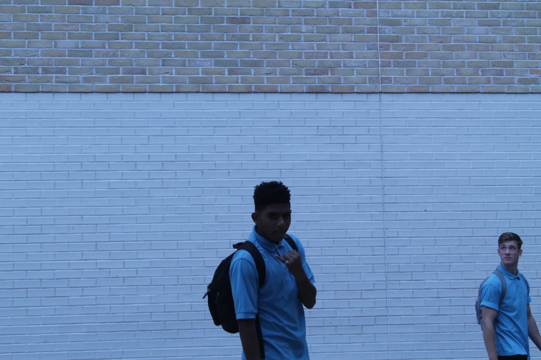
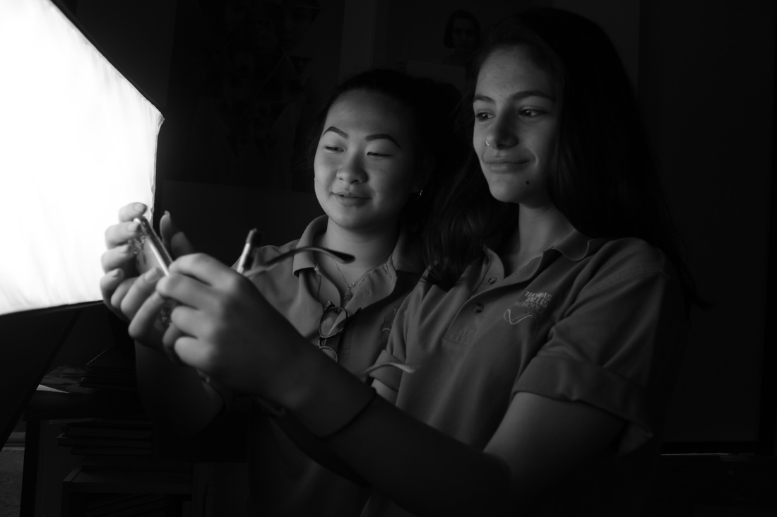
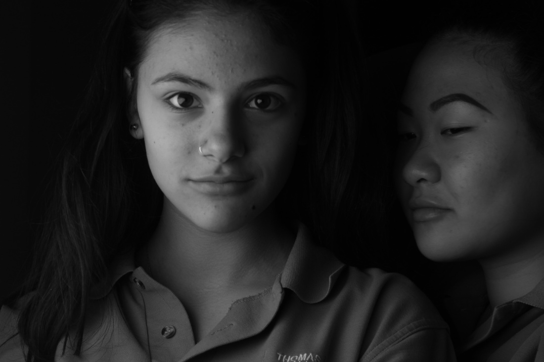
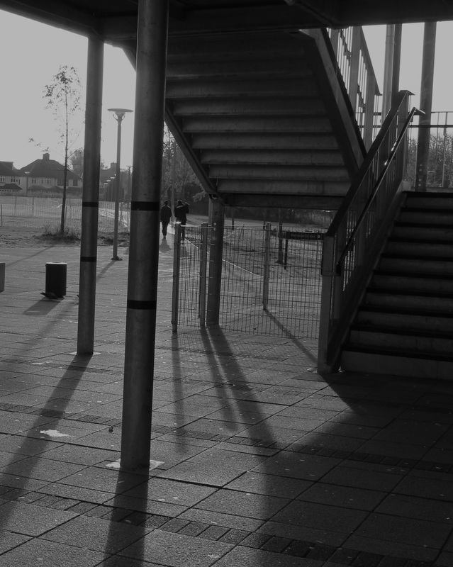
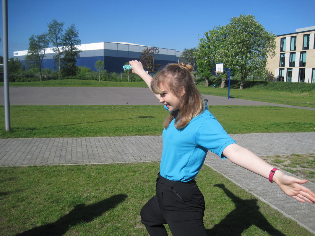
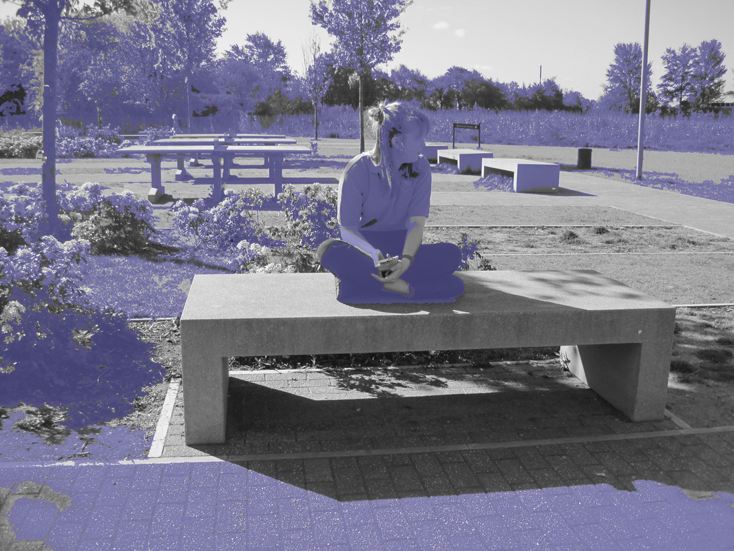
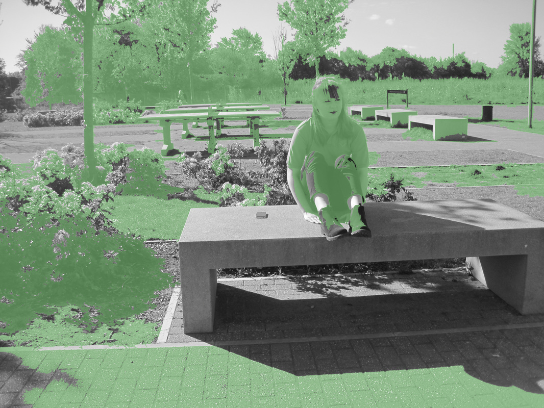
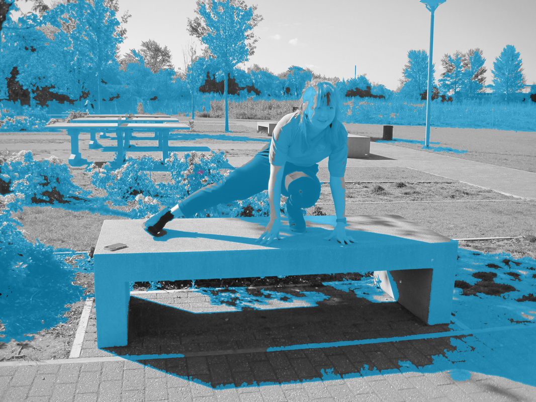
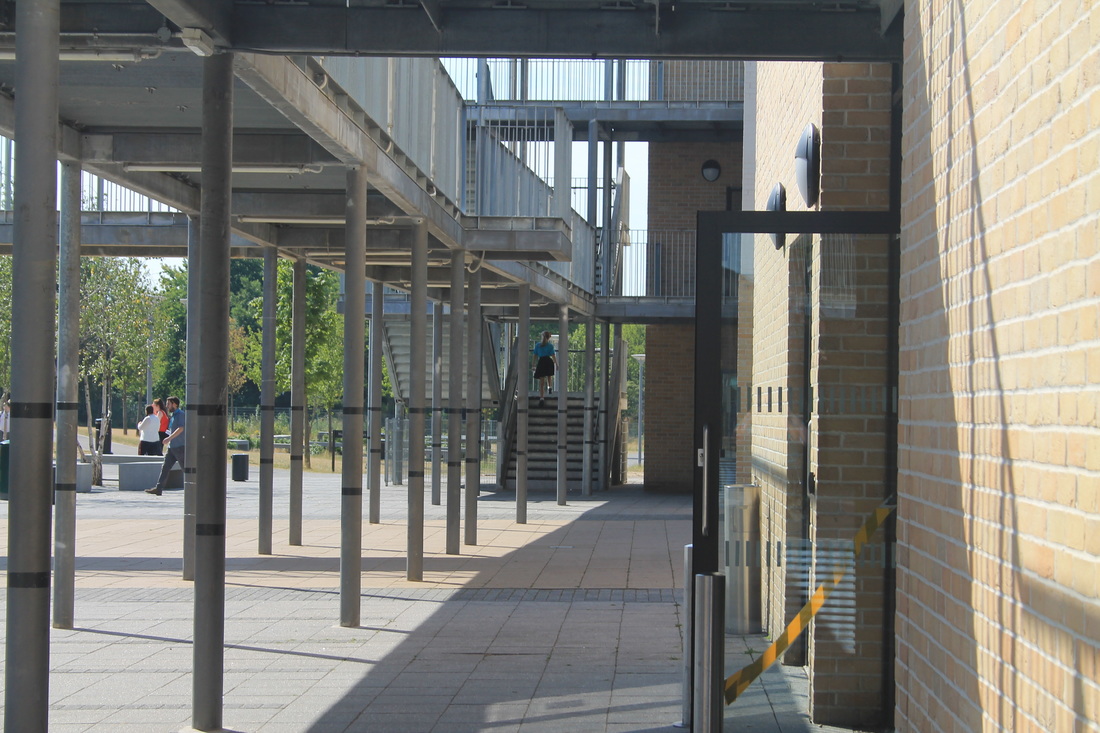
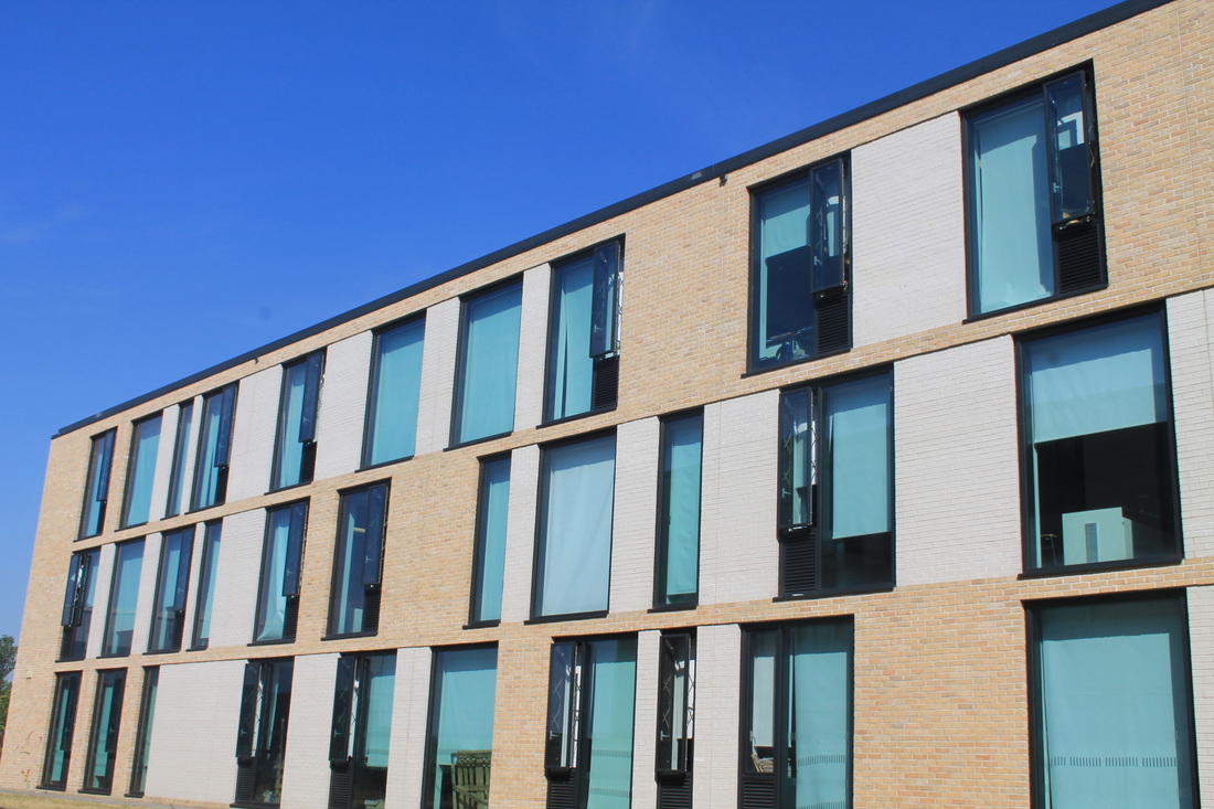
We used a dslr camera to take these images and i was satisfied with the outcome as an experiment. the camera and the day made the images quite blue which i thought was interesting. Most of the experiments i had done were to merge these images into others on photoshop.
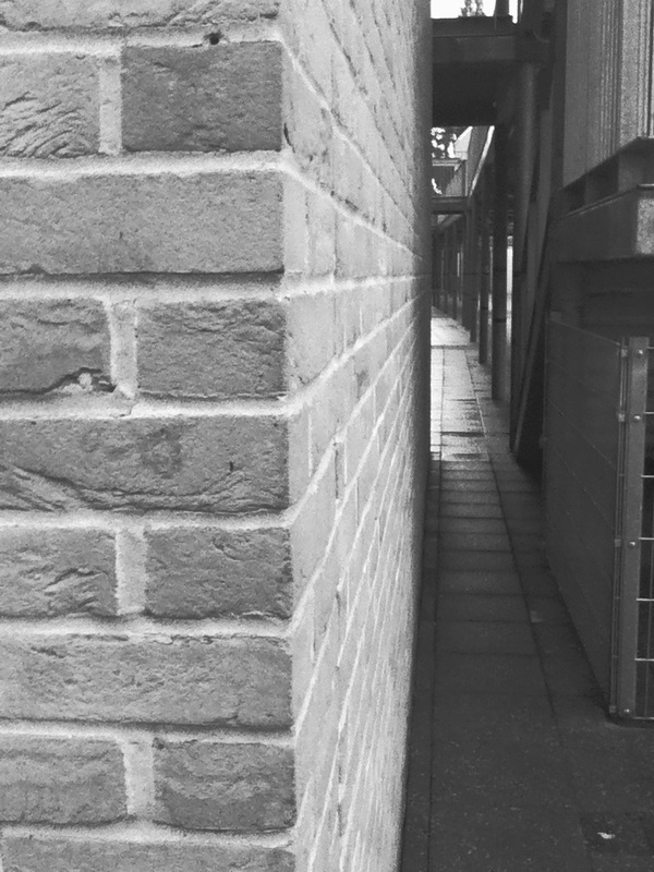
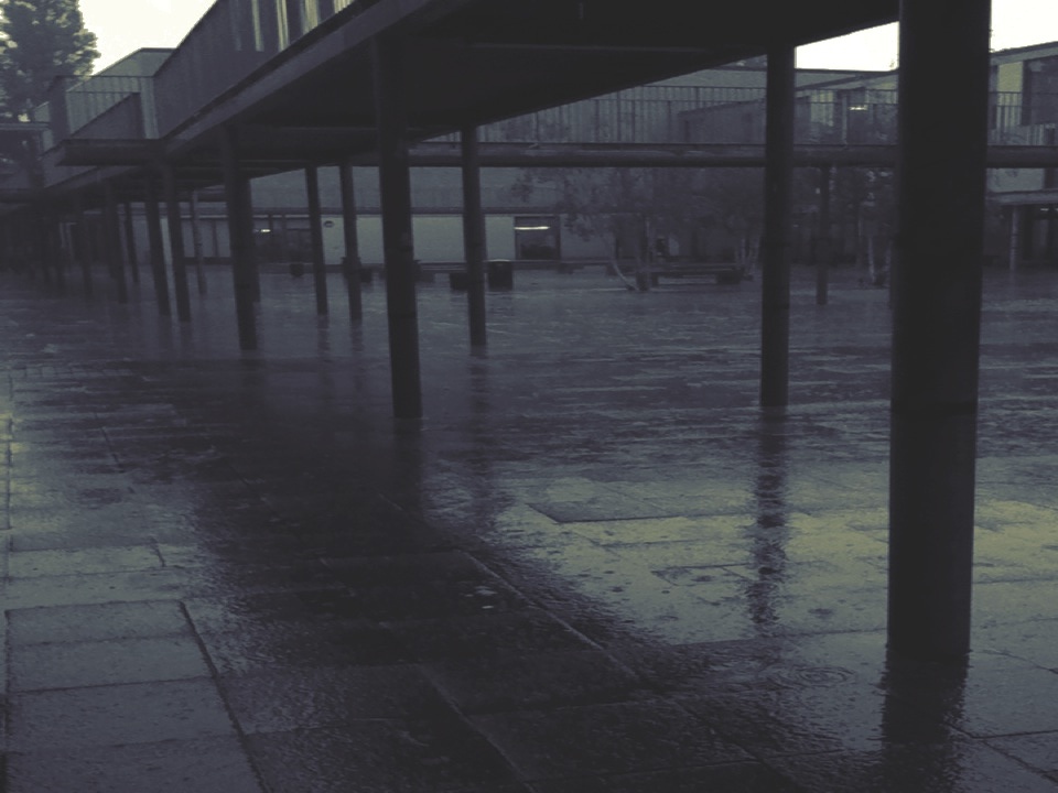
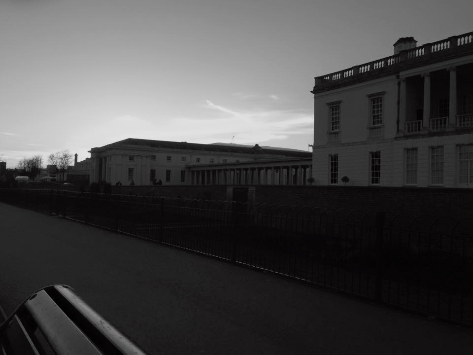
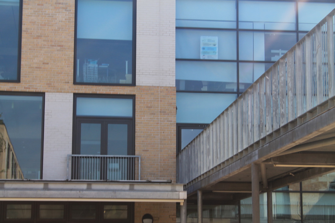
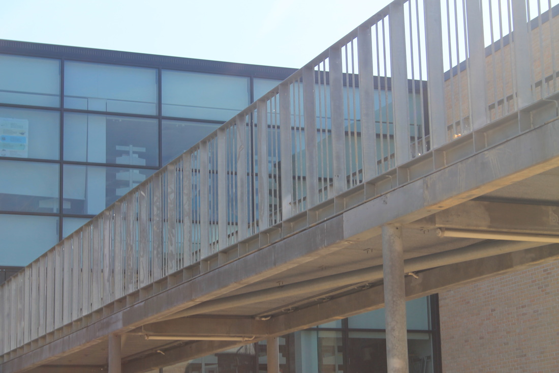
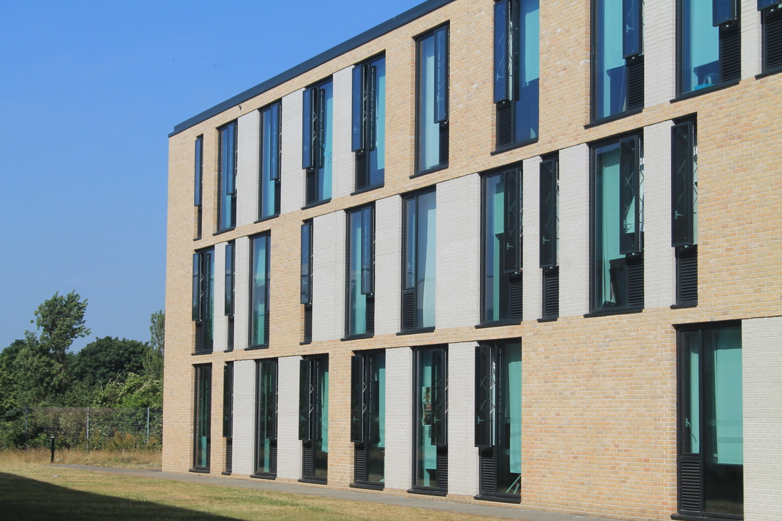
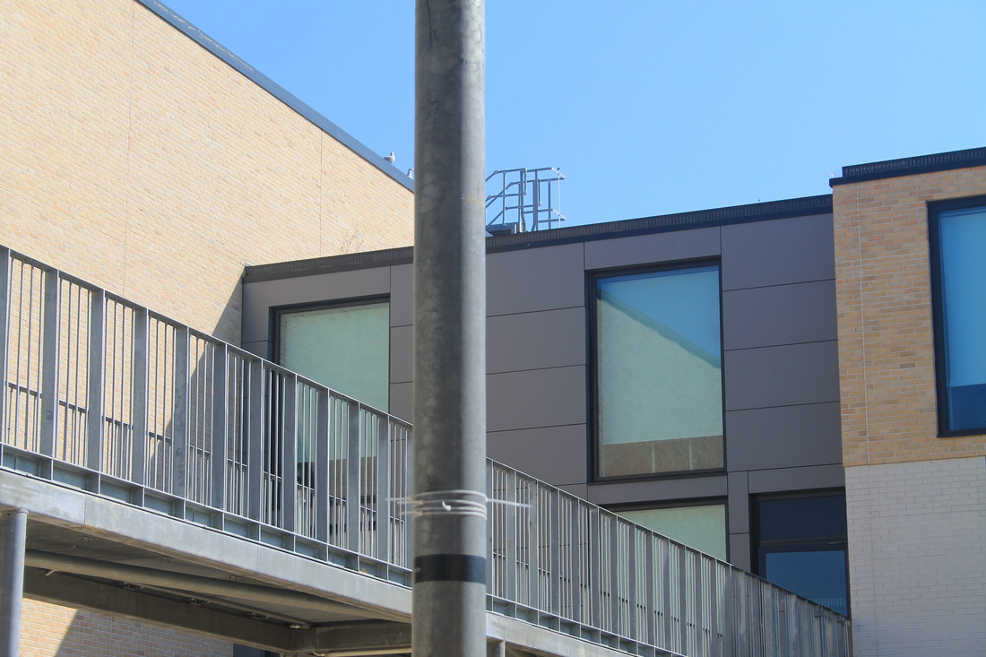
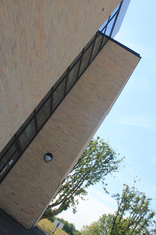
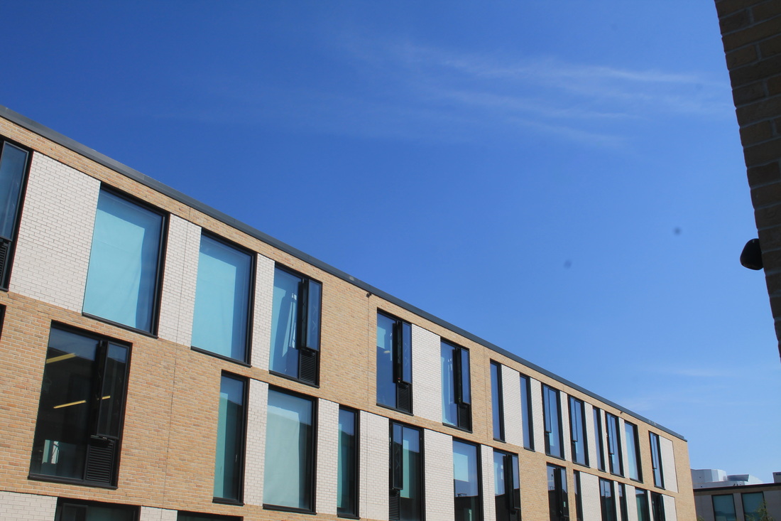
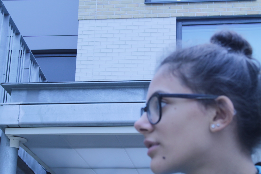
I was asked to experiment with something different and told to use an iPod and the apps to take some images. i used an app called wood camera to take this images with the filters. It was a really rainy day so it was quite hard to take pictures but i'm quite happy with the outcome with some. I like the first one and the fifth one which were both part of the school building. At this point it was boring trying to take pictures around the school of the same thing so it was hard trying to find something that i'd actually liked to take a picture of.
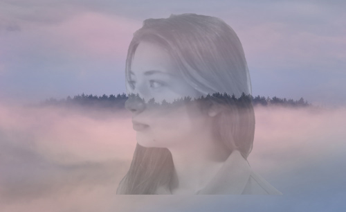
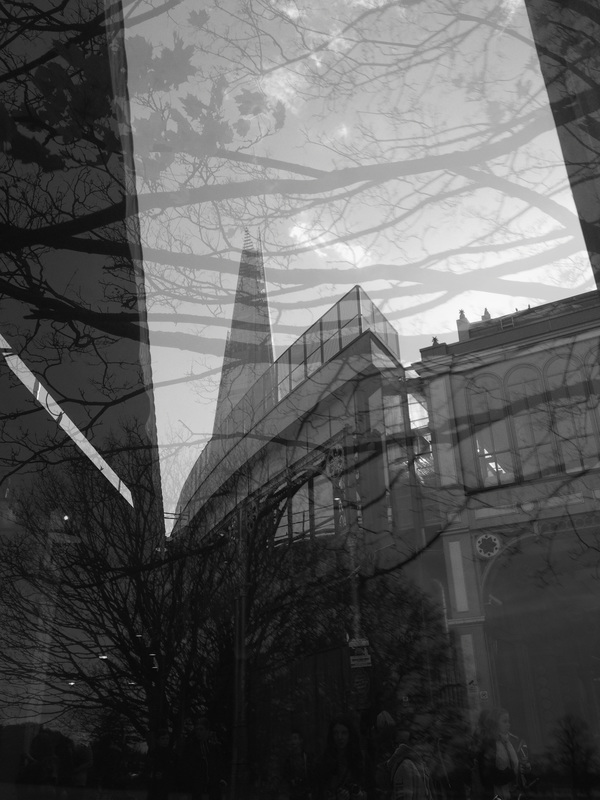
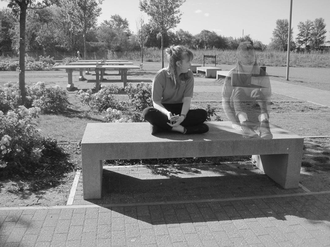
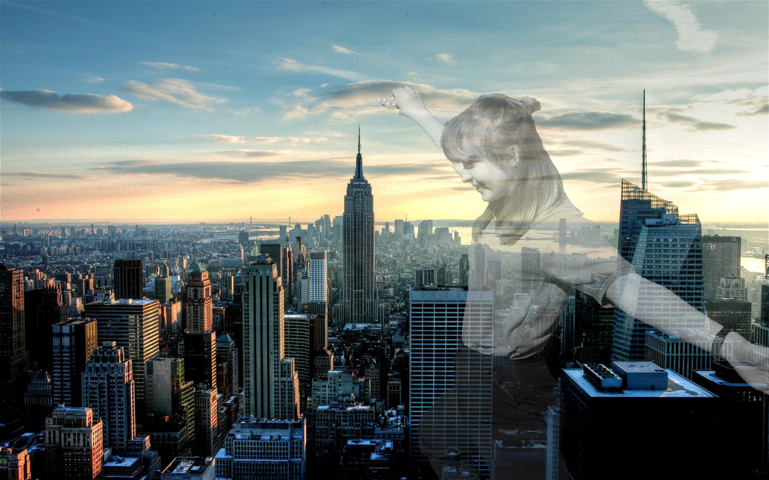
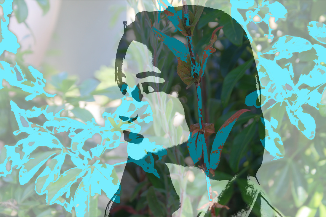
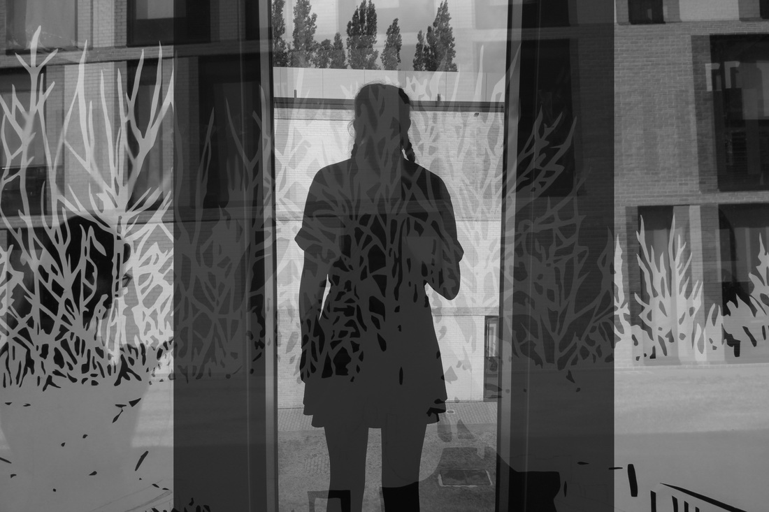
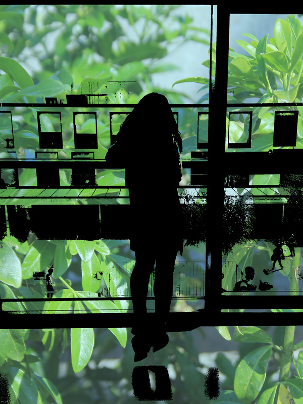
Final Pieces


Final Evaluation:
I started this project by researching a variety of artists and photographers whose work expressed the theme of contrast. during this project artists that i've researched is mainly Daido Moriyama but also Tom Hunter and Edward Weston who inspired my responses, but i've been inspired the most from pinterest posts and gathering those ideas and incorporating them into one image. My main focal point became silhouettes and i really wanted to experiment with that work and those became a feature in my final pieces.
i did an experiment with many ideas and photoshopped many images but was never fully satisfied with the outcome, so i found myself coming to dead ends and not having anymore ideas to work with. I also took many images but didn't actually use them.
Although it allowed me to develop new and better skills on photoshop, for my final images, i merged my own images together and edited them using photoshop, i experimented a lot on photoshop, so i would of liked if i went out of my comfort zone, but i was glad with the outcome of my final pieces and i think it represents contrast really well.
